-
About the company
NetApp is one of the leading global data-storage companies that delivers software, systems and services for enterprise IT administrators to manage and store their companies’ data on physical drives or on the cloud.
-
Role
Interaction design, visual design
-
Timeline
Feb 2014 to May 2014
Context and challenge
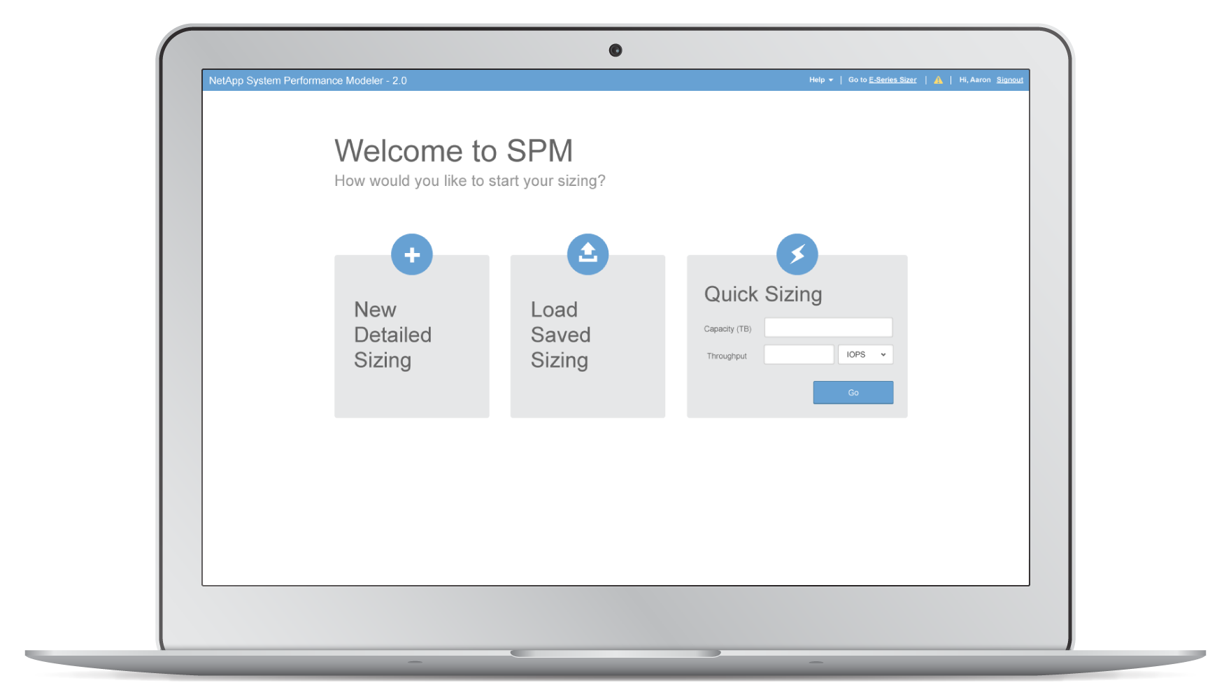
To help sales reps better gauge how much storage space their customers need and what storage solutions to recommend, NetApp created an online tool, the System Performance Modeler (SPM), aiming to make sales reps’ lives easier. However, SPM was designed from a technical perspective, with complex workflows and feature-oriented interfaces. It was not only overwhelming for beginners, but could also be difficult to use for experts in certain cases. I worked with a team of EchoUser designers and researchers, in collaboration with NetApp‘s product team, to completely overhaul the tool’s structure and functionality, and better map it to user needs.
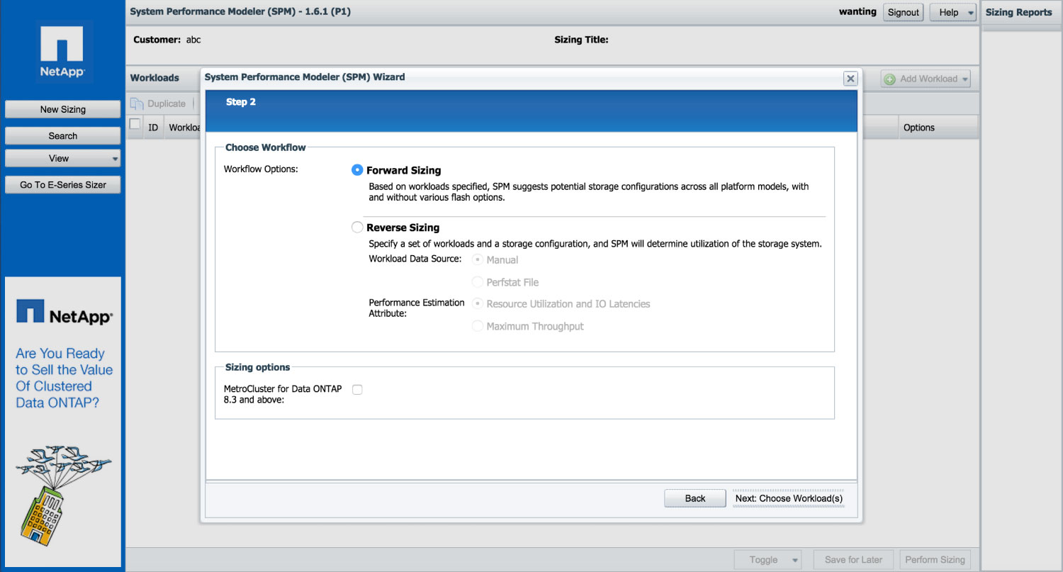
How SPM looked before the revamp
Process
Overview
In order to tightly integrate users’ needs and feedback into our process, we scoped the project into three phases: discovery, design and production. It allowed us to invest more time on user research upfront, while still keeping the feedback loop running into the second phase through the three iterative design sprints.
I was involved in all phases of the project, with a focus on creating conceptual models, use cases, user flows, wireframes and the final production work of visual design.
Phase 1: Discovery
-
Conducted user interviews
-
Defined mission statement and guiding principles
-
Created user personas
-
Created conceptual models, use cases, user scenarios and flows
Phase 2: Design
-
Sprint 1: Conceptual design
-
Sprint 2: Early wireframes
-
Sprint 3: Formative usability test and SUS Score
Phase 3: Production
-
Created UI Specs
-
Created style guide
-
Created animation for transition effects
Phase 1: Discovery—identifying users’ pain points
In the 17 remote user interviews we conducted, we tried to understand where the current SPM falls short, and where users were struggling the most. Just a few sessions in, we soon started noticing a pattern shared amongst both novice and expert SPM users—the branched, linear workflow of creating a sizing* is inefficient and confusing. It directs users to two different flows to perform fairly similar tasks. It also requires users to know exactly what they’re looking for in advance in order to choose the right path to move forward. Otherwise, users would have to start over every time they make a mistake, which is in conflict with the original intent of the tool.
This insight soon became our core direction for creating conceptual models and user flows. The main idea was to move away from the “branched, step-by-step model” to a “unified, flexible experience,” which would encourage users to explore, experiment, and compare different configuration options as opposed to punish them by doing that.
*A “sizing” refers to the process of estimating the capacity and performance on different storage configurations based on users’ need. In SPM, users usually create multiple sizings and compare their results.
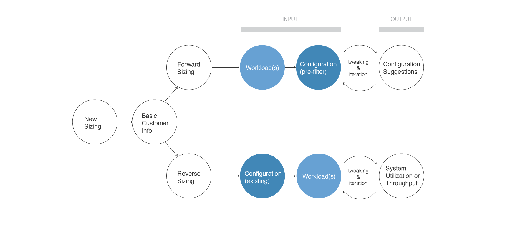
Before: the branched, linear model
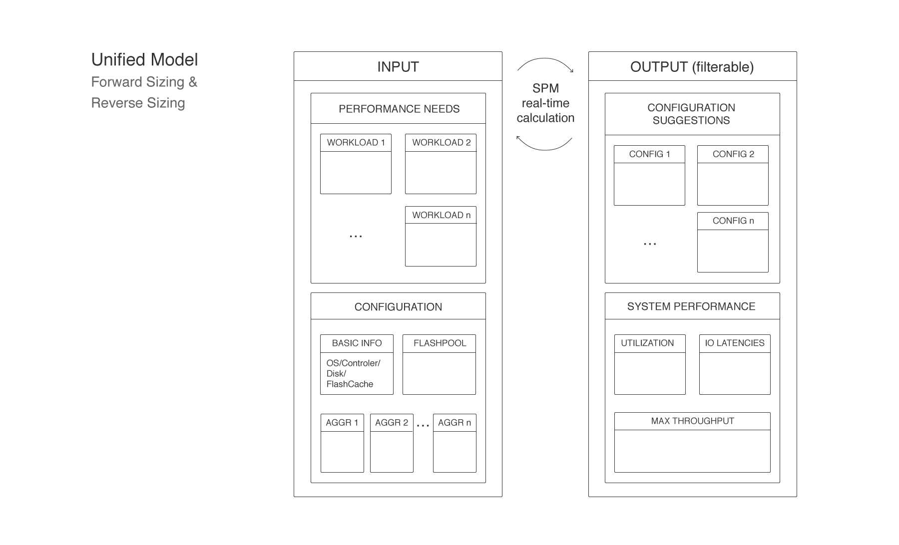
After: the unified model
Phase 2: Design—addressing users’ issues
After nailing down the conceptual model and getting buy-in from key stakeholders, we then kicked off the three iterative design sprints. Each sprint was 2 weeks long, with the first week focusing on creating new/modifying old wireframes and the second week validating those concepts through 6-8 usability tests. We started with building the key use cases first, then adding more features throughout the process. The fidelity of the wireframes were also increased gradually after more features were incorporated.
Overall, our redesign aimed to align the tool more closely with user behavior by clarifying the relationship between user input and output, facilitating frequent tweaks, and unifying needlessly fragmented functions in a single sizing workflow.
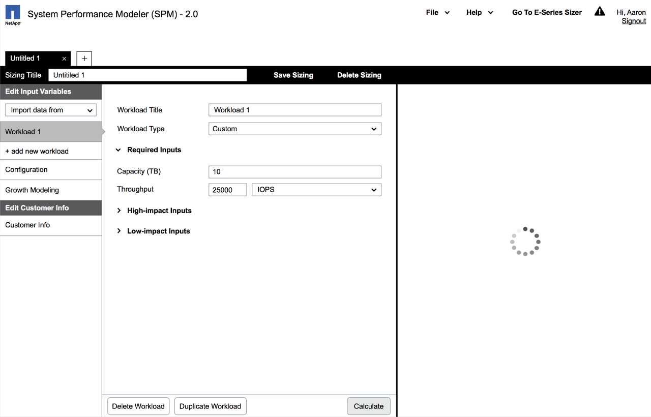
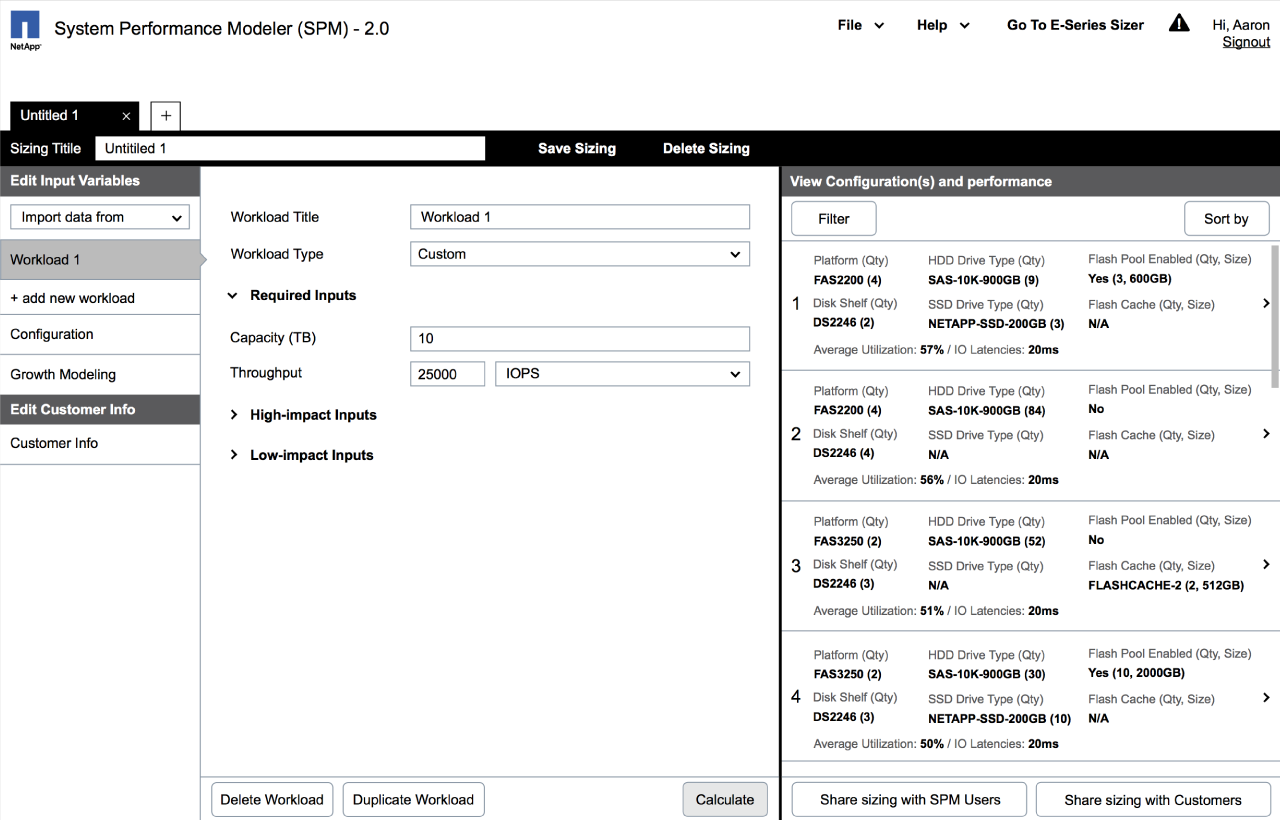
Selected wireframes from sprint 1
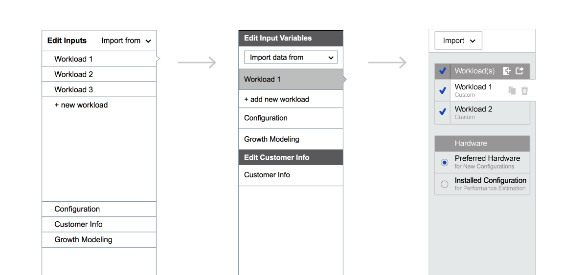
Evolution of the left navigation across three design sprints
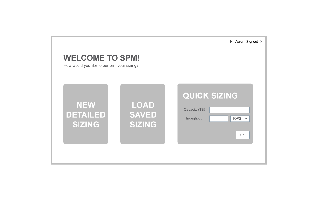
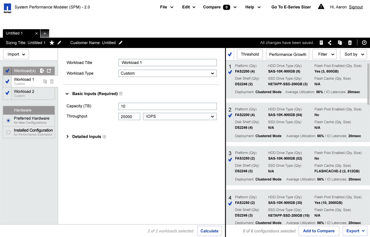
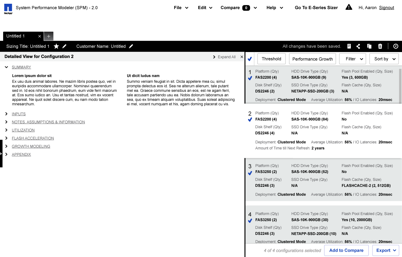
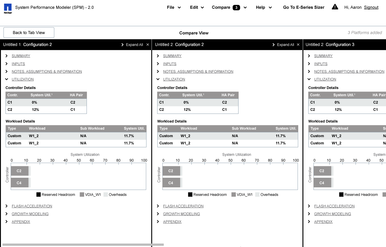
Selected wireframes from sprint 3
Phase 3: Production
An the end of the second phase and going into the third phase, we started to include the development team into the the process, having regular check-in meetings to make sure that our design fits into the technical constraints. We also worked with the developers to figure out what final deliverables work the best for their needs. In the end, we delivered a deck of annotated UI specs communicating interaction behaviors, as well as a visual style guide for layouts, typography, iconography, color palette, and animations.
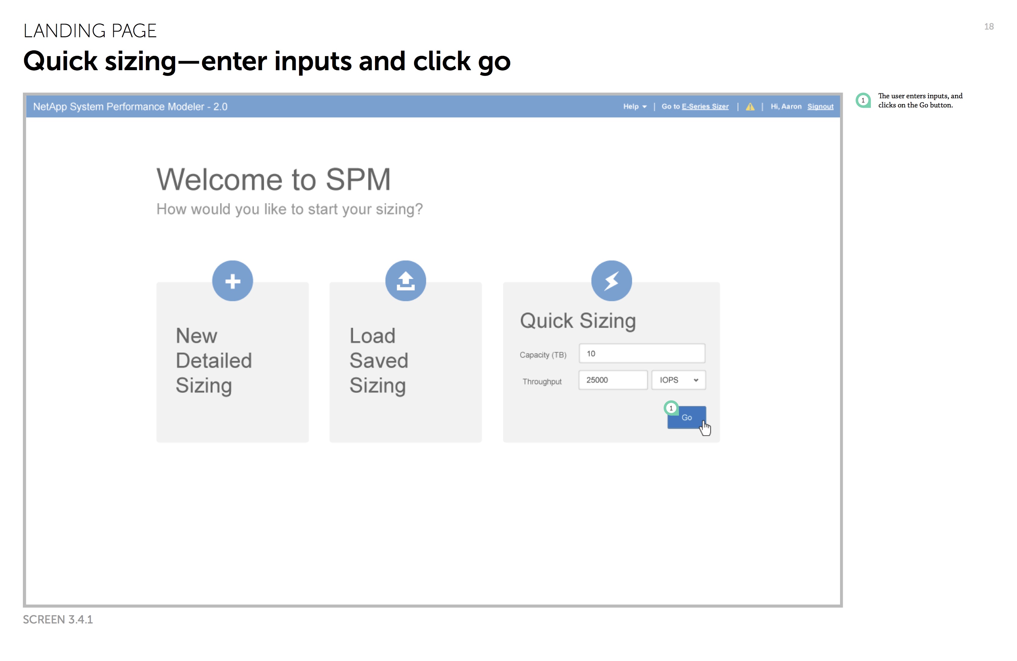
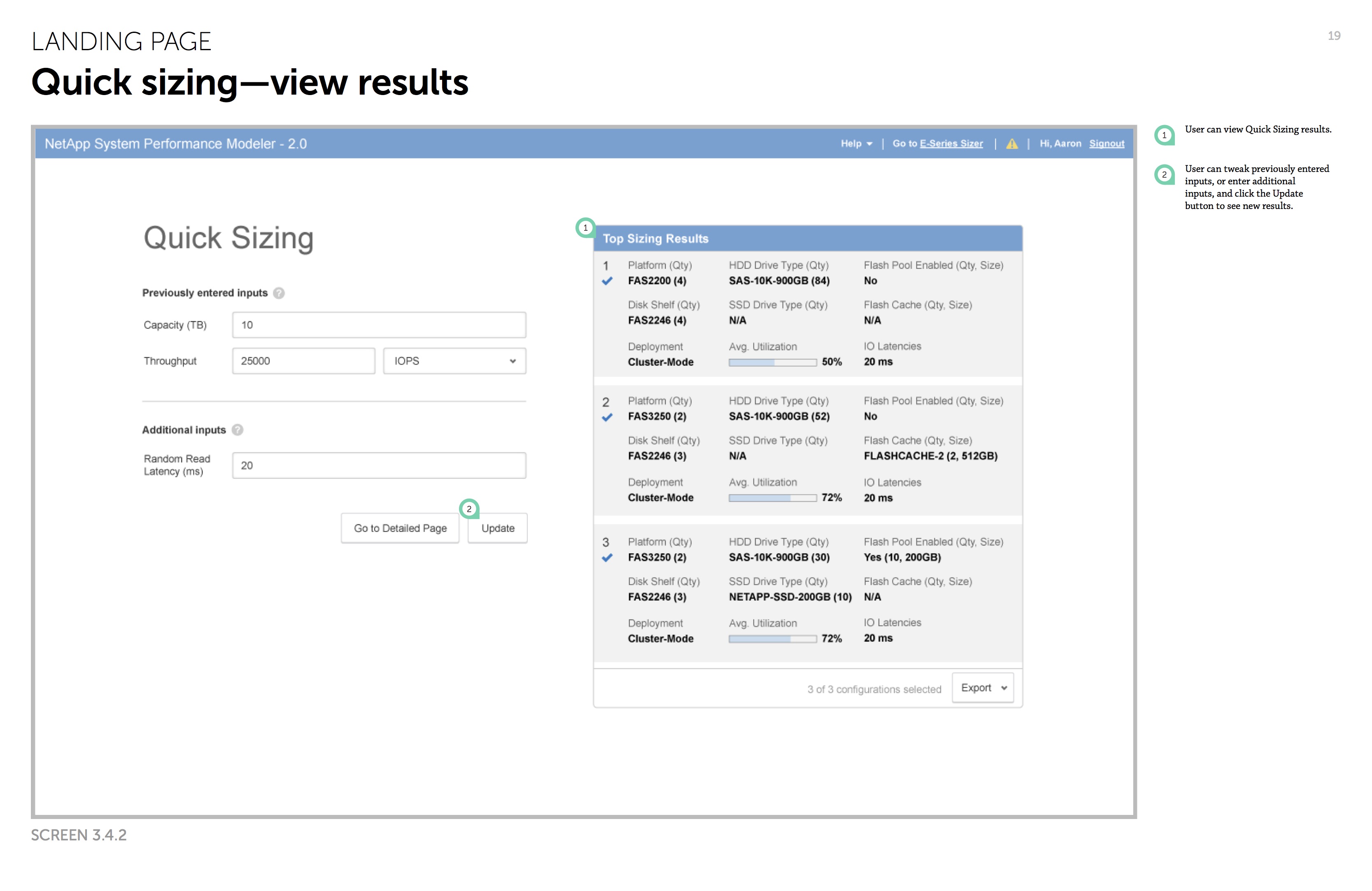
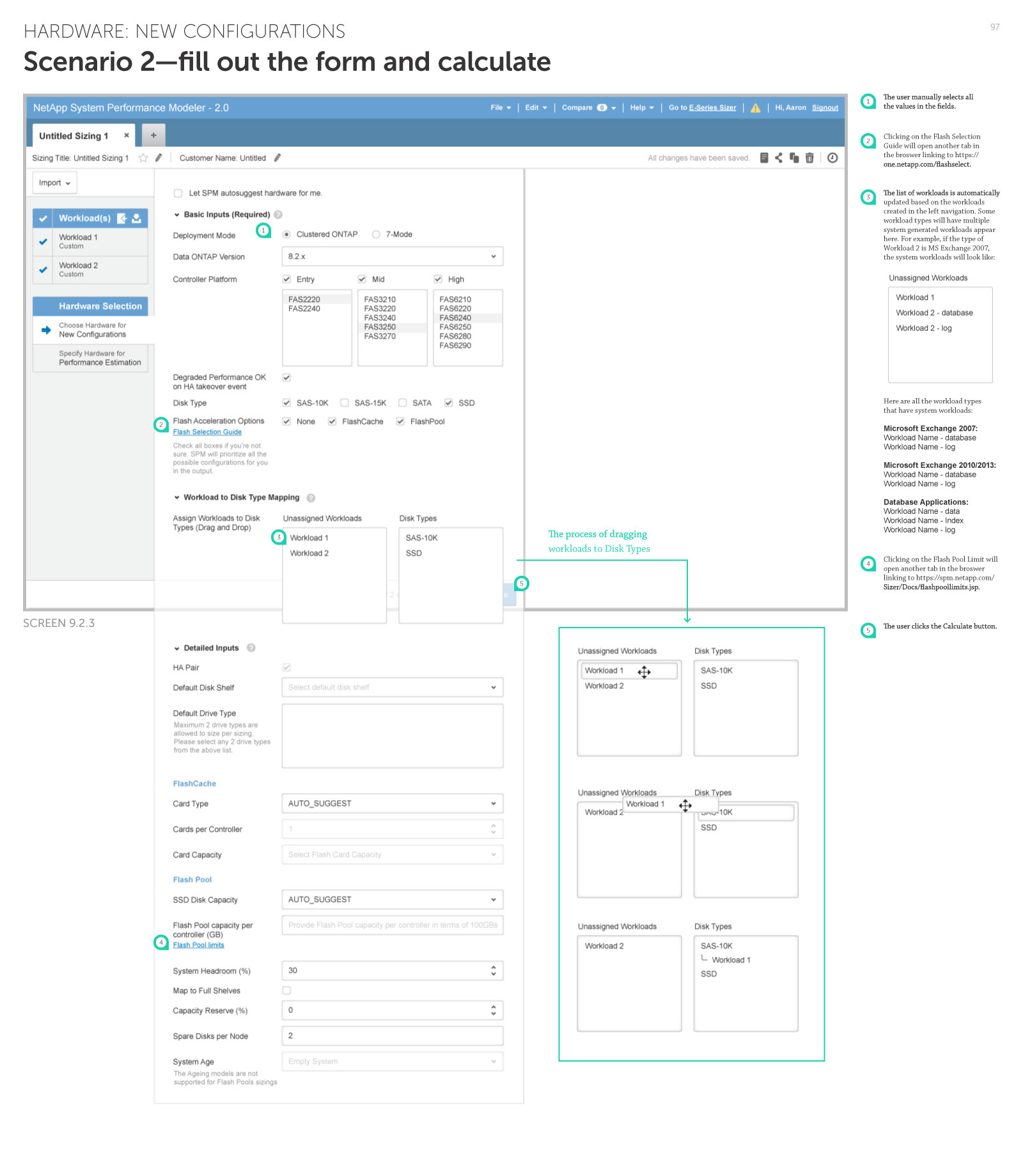
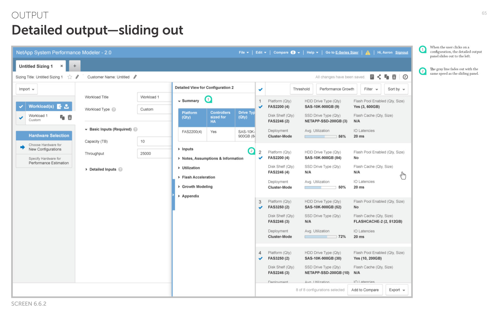
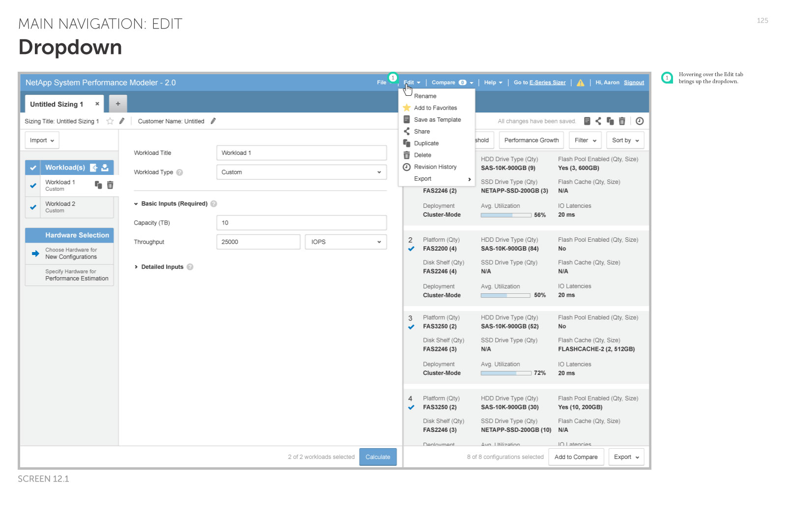
Selected pages in the UI spec
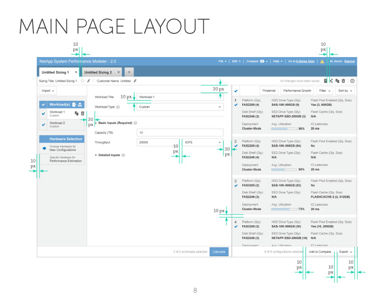
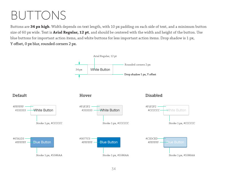
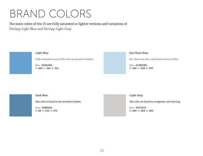
Selected pages in the style guide
Result and reflection
In the last round of the usability testing, the System Usability Scale (SUS) score* across all 9 participants was improved from the pre-redesigned design's 60 something to 85.8, which is equivalent to a huge leap from the 30th percentile rank to the 90th percentile rank. Also, when asked “How would you rate this design in comparison to the current version of SPM?” (with 1 being much worse and 10 being much improved) in the end of each session, the average score was 8.33/10. Both we and the client were really happy with the result and confident that we had delivered something that significantly improves SPM users’ day-to-day workflow.
Looking back, I think a well-defined user-centered process really helped us understand users’ needs early on, and also helped us better communicate our design rationale to the clients. Near the end of the project, it was pretty satisfying to see the product managers we worked with becoming just as excited about asking the right questions in the usability tests as us! I think the iterative design approach not only provided us useful design feedback, but also brought the whole team together on the same page.
* The System Usability Scale (SUS) provides a “quick and dirty”, reliable tool for measuring usability. It consists of a 10-item questionnaire with five response options for respondents; from Strongly agree to Strongly disagree. Originally created by John Brooke in 1986, it allows researchers to evaluate a wide variety of products and services, including hardware, software, mobile devices, websites and applications.