-
About the company
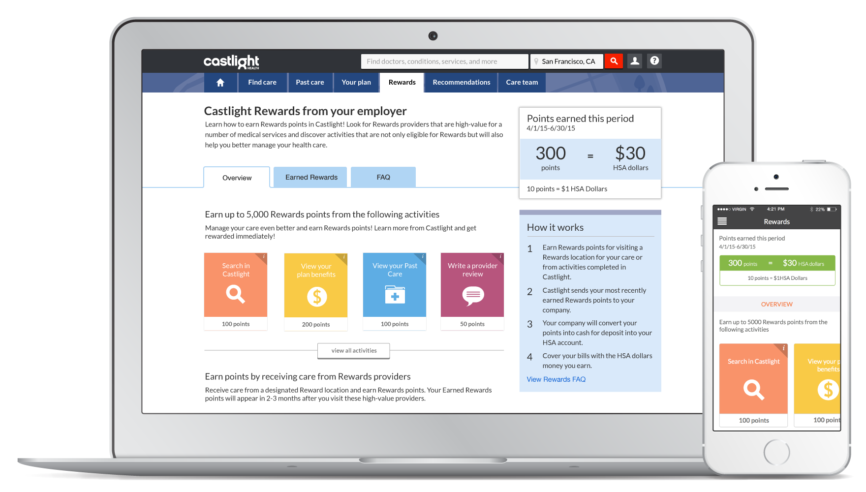
Castlight Health provides a healthcare platform for large employers to understand and manage their healthcare investments for their employees. From the employee’s perspective, the platform helps them make better healthcare decisions — for example, finding a doctor, seeing the price and quality information specifically for their insurance plans, and organizing their past health care claims.
-
Role
Design strategy, interaction design, HTML prototyping, usability testing, visual design
-
Timeline
Mar. 2015 to Apr. 2015
Context and challenge
Castlight has a rewards program on their platform. It was functional but had a lack of attention from users. Most users don’t see the rewards program as one of their main motivations of staying engaged on the site.
Thus, Castlight’s team came to EchoUser with an open mind. The long-term goal of the project is to come up with some design strategies and concepts to make the program reach its full potential. But in the short run, the concepts had to be able to be scoped down to something manageable that the team could start building right away.
I worked on this project as the lead designer, in collaboration with the product team in Castlight, to envision the future rewards program.
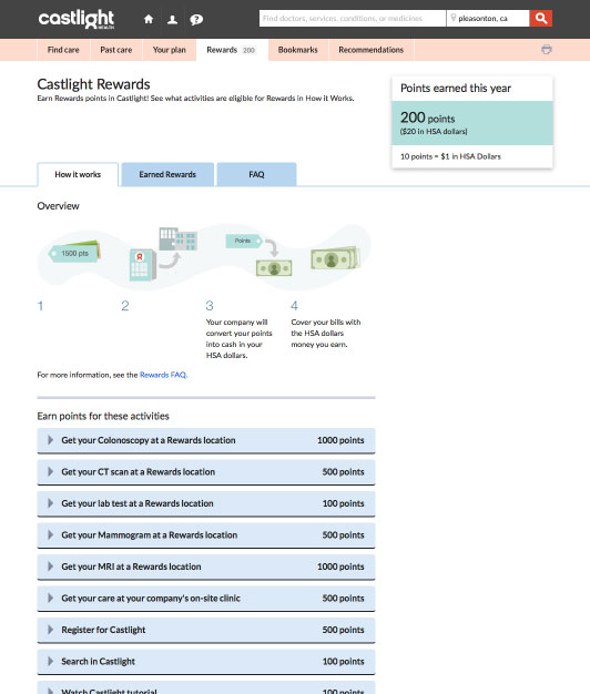
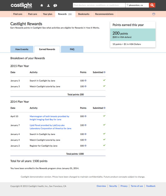
The existing web pages of the rewards program before the redesign
Phase 1: short-term improvement
Leveraging behavioral design techniques to solve existing problems
One of the major problems customers complained about laid in the fact that there were too many Rewards activities for them to do without any prioritization. Since most people don’t act as rational decision makers, it overwhelmed them and discouraged them from taking actions.
Because of that, my first instinct was to research and apply some behavioral design techniques to better organize the existing information on the page.
Some techniques used in this redesign:
-
Limited choices—It’s often easier to make a decision when presented with only a few choices.
-
BJ Fogg Behavior Model—Tasks that are easier to do are a better starting point for people with low motivation.
-
Collecting—It’s human’s natural drive to collect. Collectors can be driven by emotional attachment to items, rather than collecting for purely functional reasons.
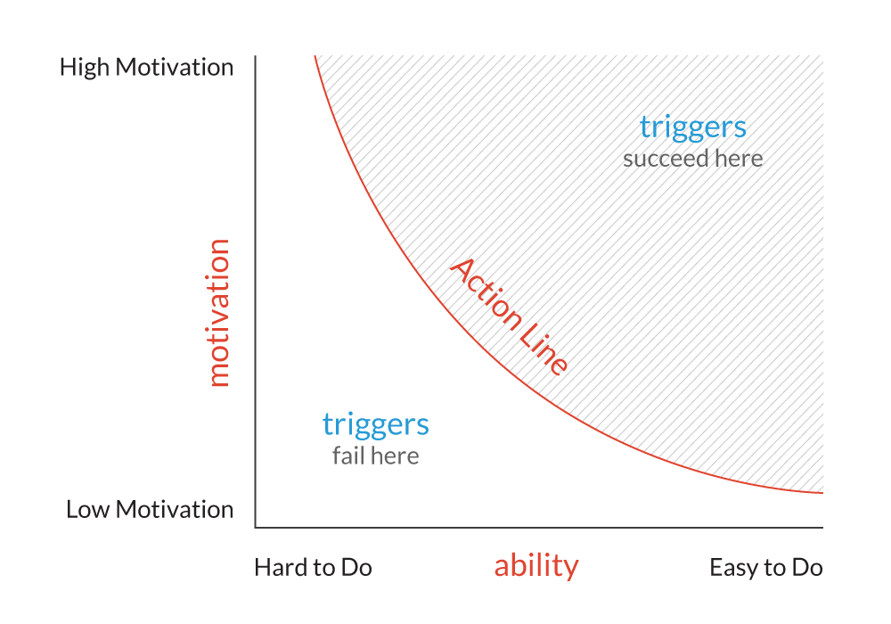
BJ Fogg Behavior Model
Wireframing
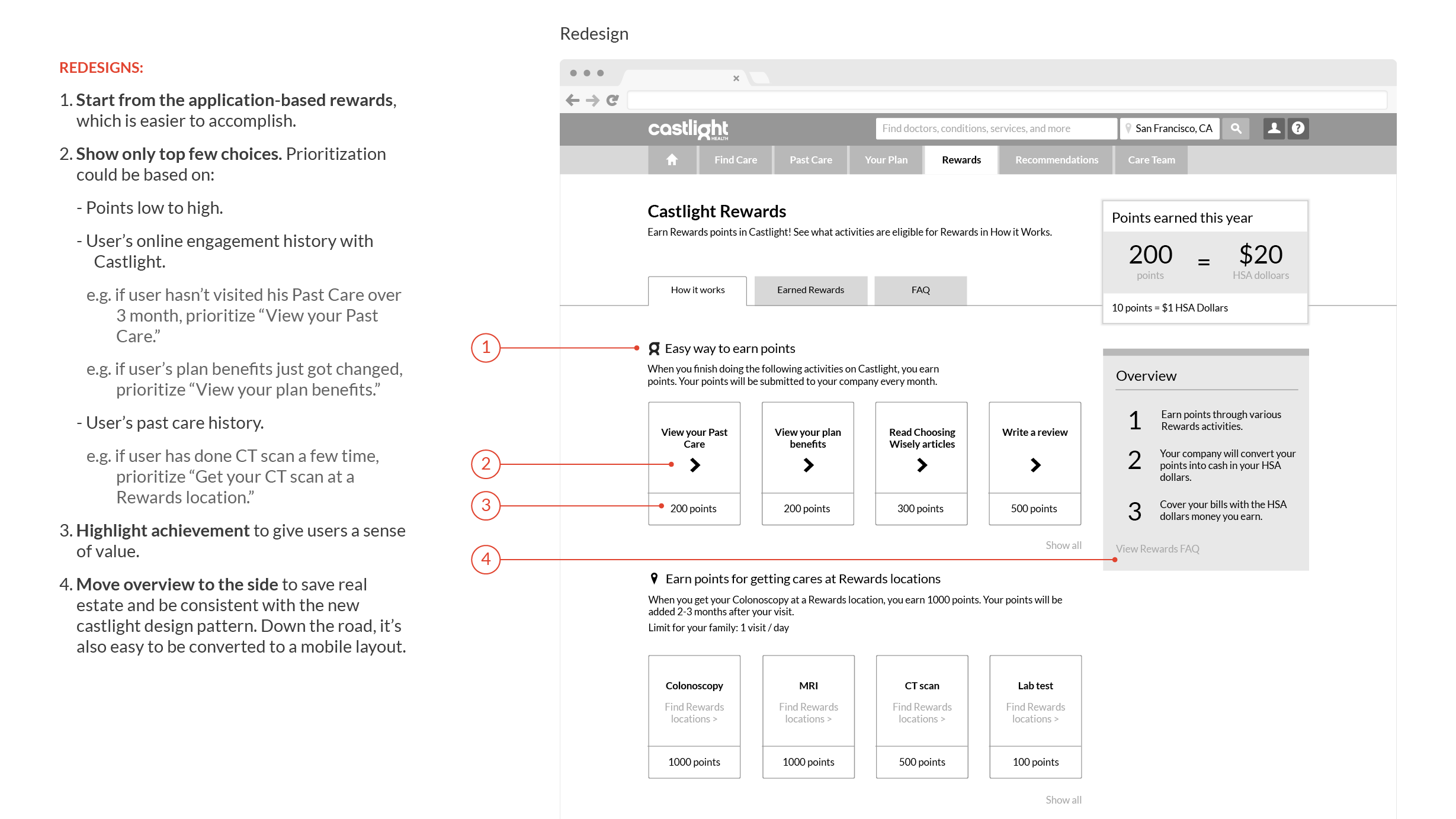
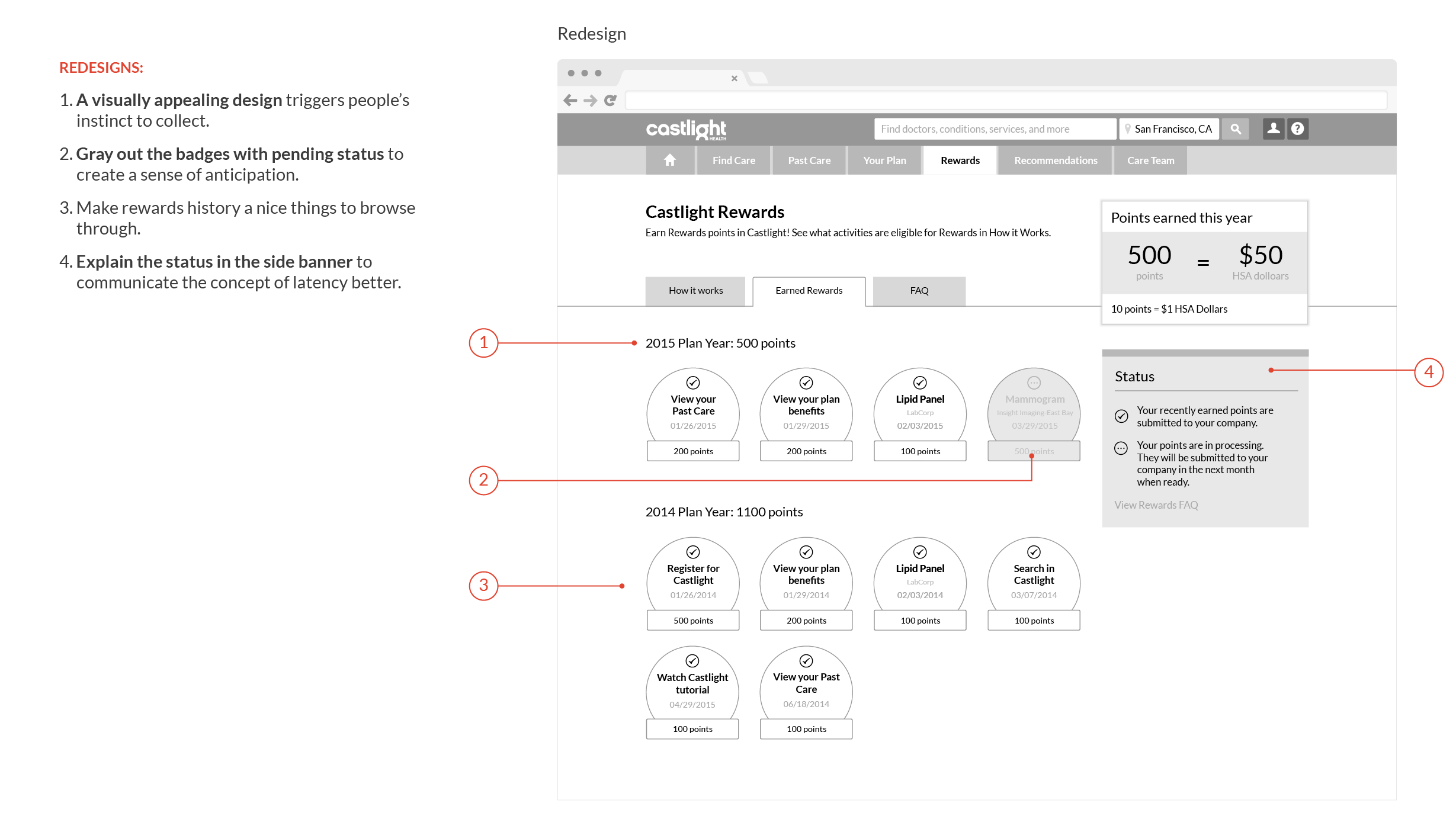
Based on the research, I then started to play with a few key design concepts by creating mid-fidelity wireframes. Those concepts were:
-
Limit the rewards activities—only show a few options at a time so that it's less overwhelming.
-
Prioritize the rewards activities from the easiest/least time-consuming to the hardest/most time-consuming so that it's less intimidating for first time users.
-
Highlight earned rewards as badges, which encourages users to collect more.
How it works
Earned rewards
Prototyping and validating the design through usability tests
Since the design included some interaction details that might affect users’ understanding of the program, I went with creating hi-fidelity HTML interactive prototypes for testing to capture this level of feedback.
With recruiting help from Castlight, I was able to conduct 3 usability sessions. In the sessions, participants were prompted to freely explore the prototype as well as perform a few rewards activities. Showing the concept in front of real users helped me spot some minor design issues. But overall, both the feedback and the result from the wrap-up questions were positive.
Finalizing visual details and mobile design
After fixing the issues, I then worked with the development team to create visual specs and production assets. A mobile version of mocks was also created to bring the same experience to Castlight's developing HTML5 web app.
Usability wrap-up questions
How easy is it to understand the Rewards program?

How easy is it to take actions?

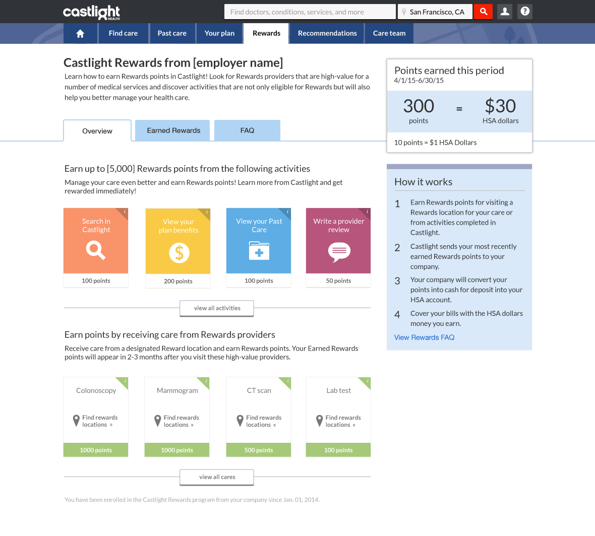
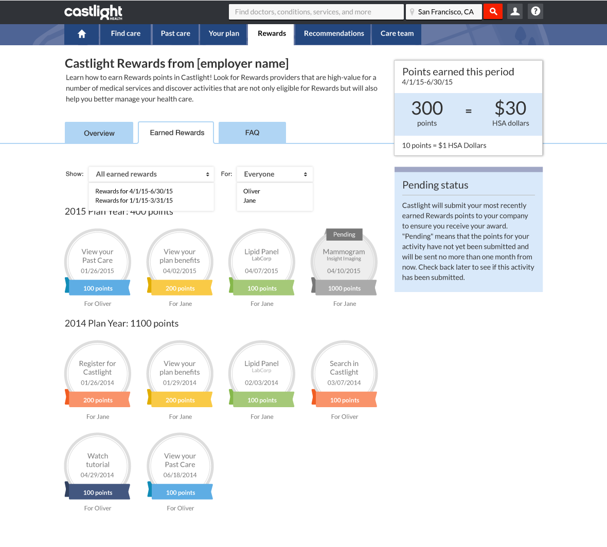
Final mocks for the desktop site
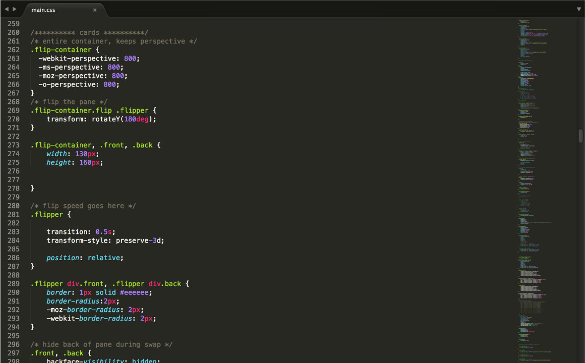
CSS3 transition for cards
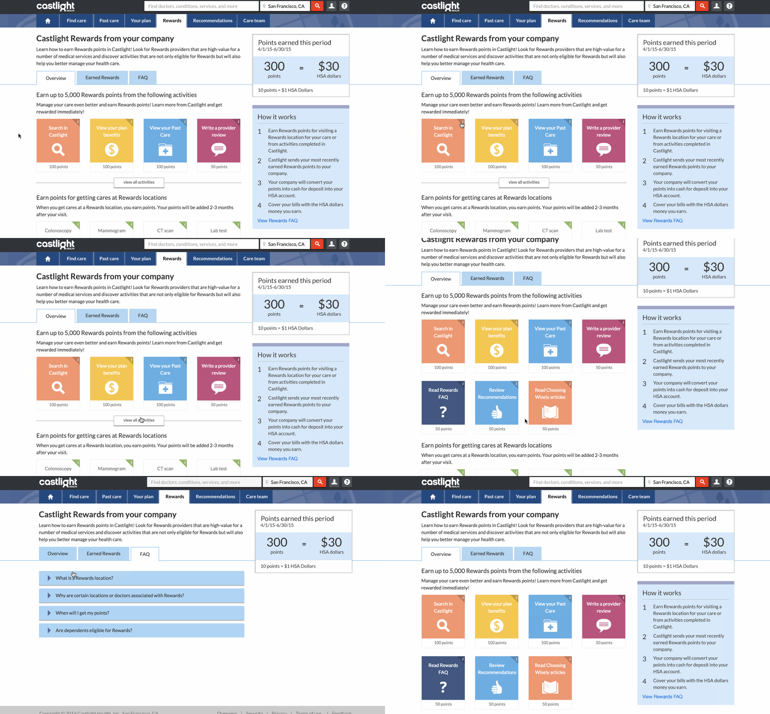
Some interactions in the prototype
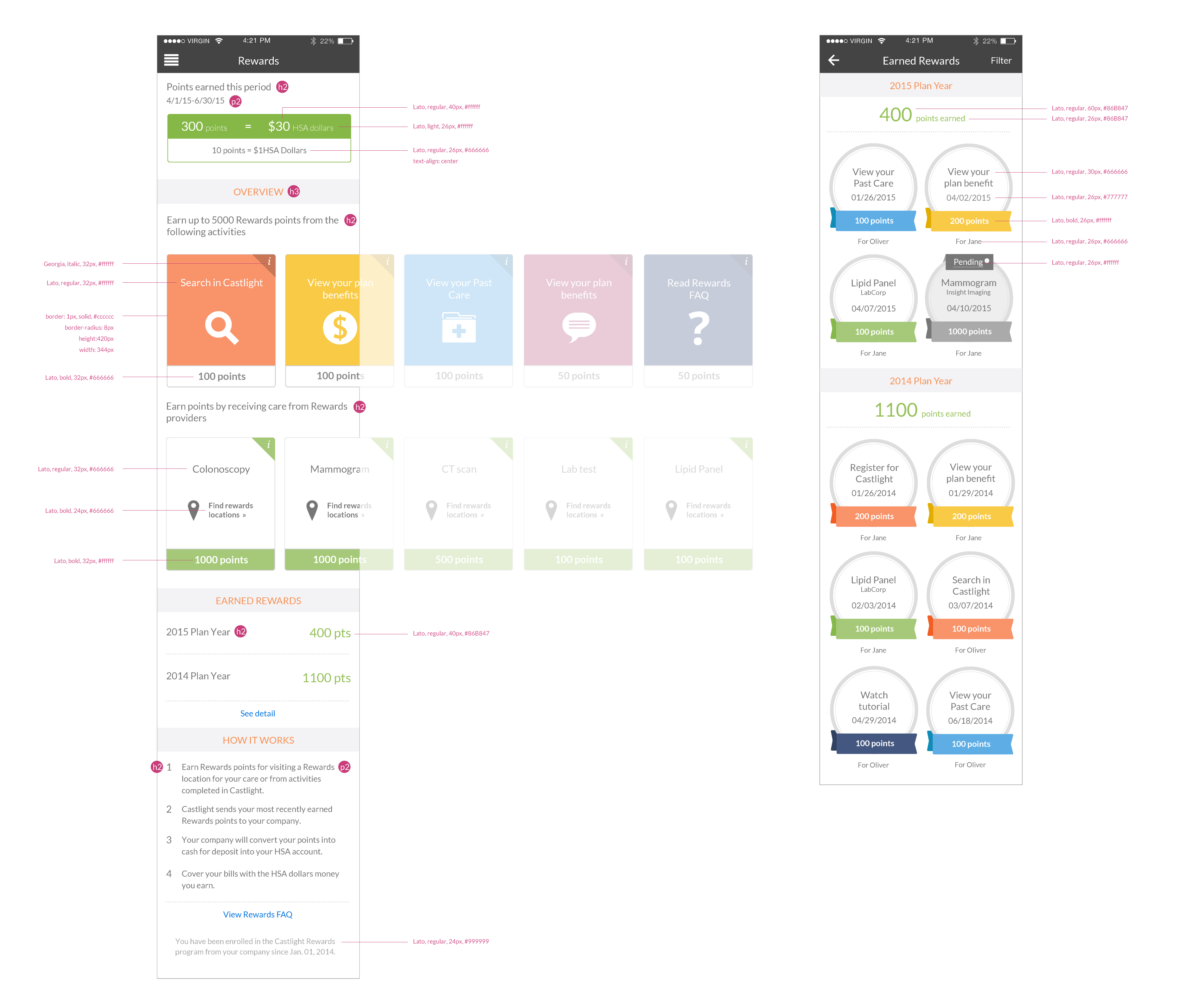
Visual specs for mobile
Phase 2: long-term design strategy
Reframing the design problem
After analyzing the current program's user flow, I realized that the linear interaction model is where the main problem was. The current user flow goes like this:
-
Users get prompted to the rewards page from other pages or emails.
-
They notice a list of activities.
-
They finish one activity and get some points.
Then that’s it. There is no clear feedback loop or other incentives to motivate users to come back again.

Before: the linear model
As a result, I proposed a gamified model building on top of what we already had. The model came with a couple of concepts that Castlight could start doing A/B testing on the site in the next few quarters. The concepts all focused on creating an engagement loop that would motivate people to come back to the program. For example:
-
Creating milestones for users to achieve.
-
Leveraging social proof by comparing the rewards user got with their coworkers.
-
Creating a sense of scarcity by limiting the rewards’ time frames.
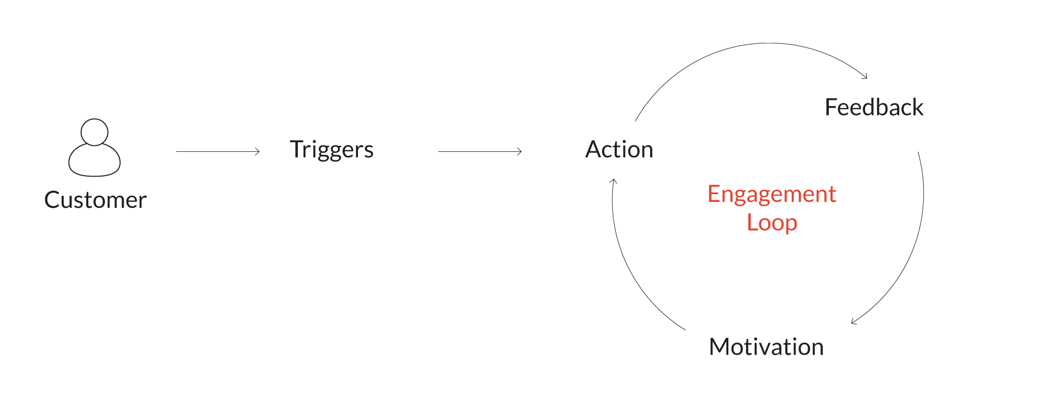
After: the gamified model inspired by Kevin Werbach
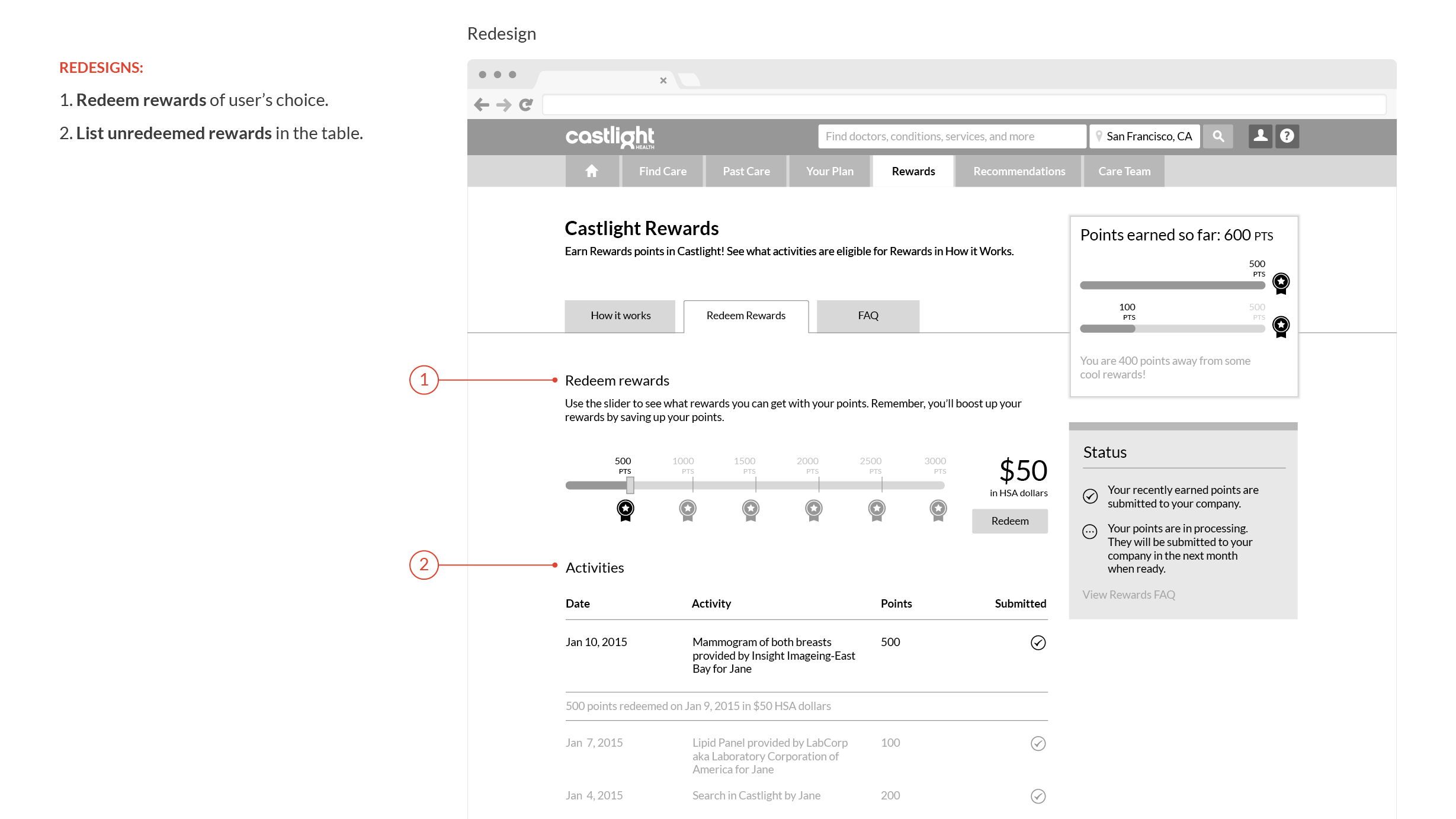
Creating milestones
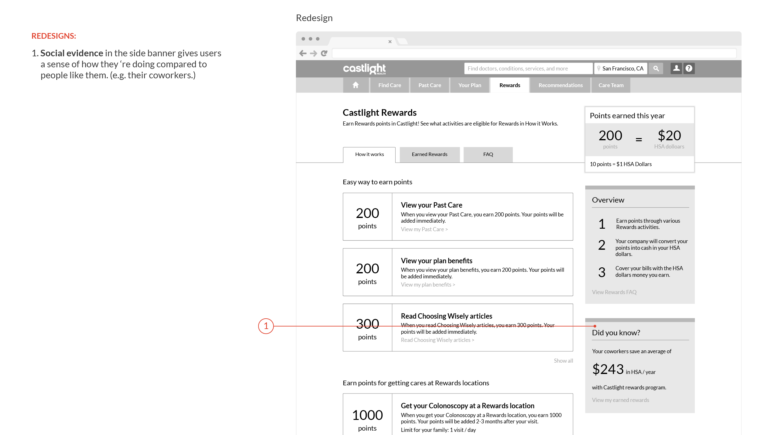
Creating social proof
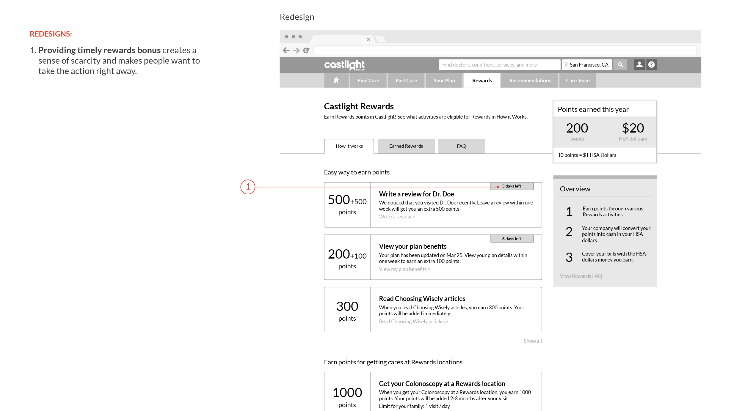
Creating sense of scarcity
Reflection
Designing for changing people’s behavior is always tricky. It’s hard to get genuine feedback from real users early on because what they say in a lab environment might be different from what they actually do in the field. This project really pushed me to think about not only the behavioral design side of things, but also the long-term roadmap of how the team may validate the design along the way.