-
About the company
Candy House is an early stage startup focusing on making smart home devices to support a minimal yet joyful lifestyle. Their very first product, Sesame, is a smart lock that allows people to control and keep track of it remotely with their smartphones.
-
Role
Brand identity, interaction design, visual design
-
Timeline
Sep 2014 to early 2015
Context
I was approached for this project by the founder of Candy House when their first product, the Sesame Smart Lock, was still a semi-functional prototype. With initial seed funding settled in, Candy House needed some design help to create a fresh brand identity, as well as help creating their very first public website, and mobile apps for both iOS and Android from the ground up.

Some prototypes of the Sesame lock
Challenge
To Candy House’s disadvantage, the current smart lock market is full of products that failed to fulfill their promises. Fit issues, spotty connectivity, difficult installation processes, etc., all these have caused consumers to become more and more skeptical about other upcoming smart locks. Thus, our goal was to not only deliver a product that’s easy to use, but also clearly communicated the value of Sesame to differentiate it from current market.
Process
Brand identity
I started with creating a brand identity that sets the tone for the rest of the digital products. Working closely with the founder, we first made sure that the key product questions were addressed in the creative brief.
Based on the direction, I then started creating a moodboard to organize my inspirations and get additional feedback. The moodboard then set the foundation of the following logo design, color palette, and typography.
Creative brief excerpt
Who are the target audiences?
Modern people who enjoy having control of their lives to achieve a minimal yet joyful lifestyle.
Who are the competitors?
August Smart Lock, Lockitron.
What makes Sesame unique?
Price—$100 v.s. $200-$300 from competitors.
Simplicity—The product is an attachment to the existing lock, which doesn’t require any uninstallation.
Accessibility—People who are subject to any restrictions of remodeling their homes, such as renters, students, travelers, can still benefit from the product.
What personality does Candy House want to project to their audience?
Minimalist, simple, joyful, playful, high quality.
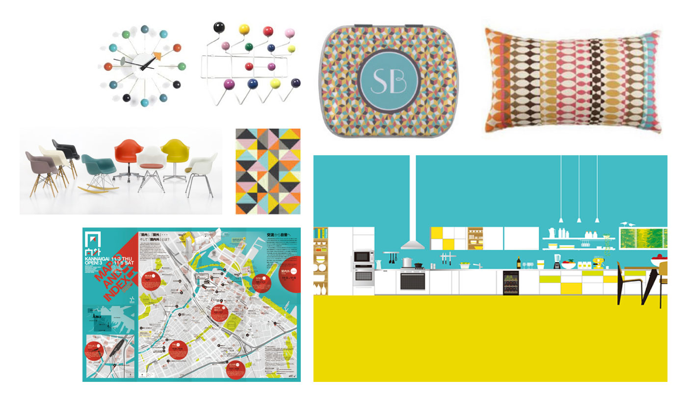
Moodboard
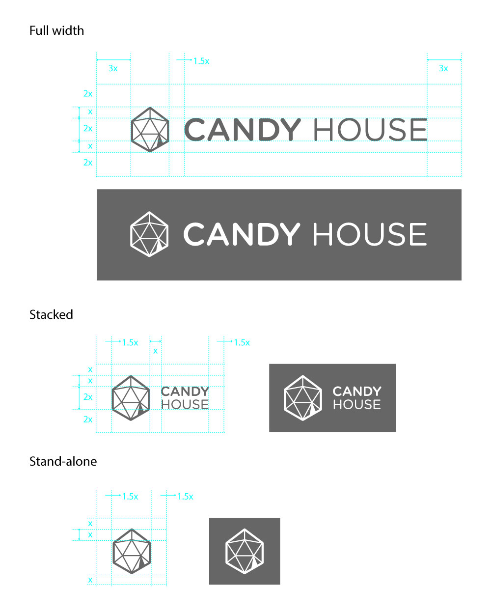
Final logo guideline
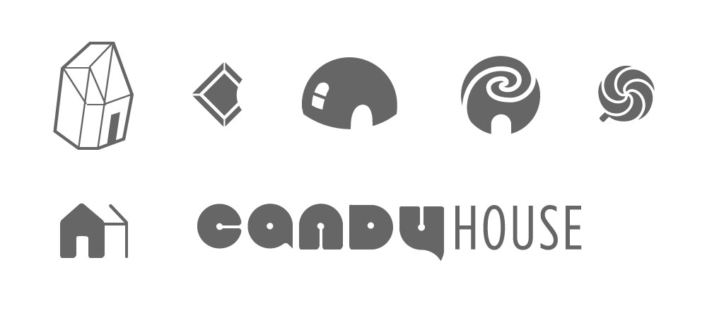
Some logo explorations
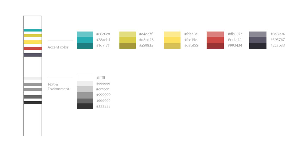
Color palette
Public website
Since Candy House was still uncertain about what their future product line would look like, I wanted to provide a flexible website structure that could scale naturally as the company grows. The architecture work was started first, then wireframes and final visual mocks were created iteratively into the development phase.
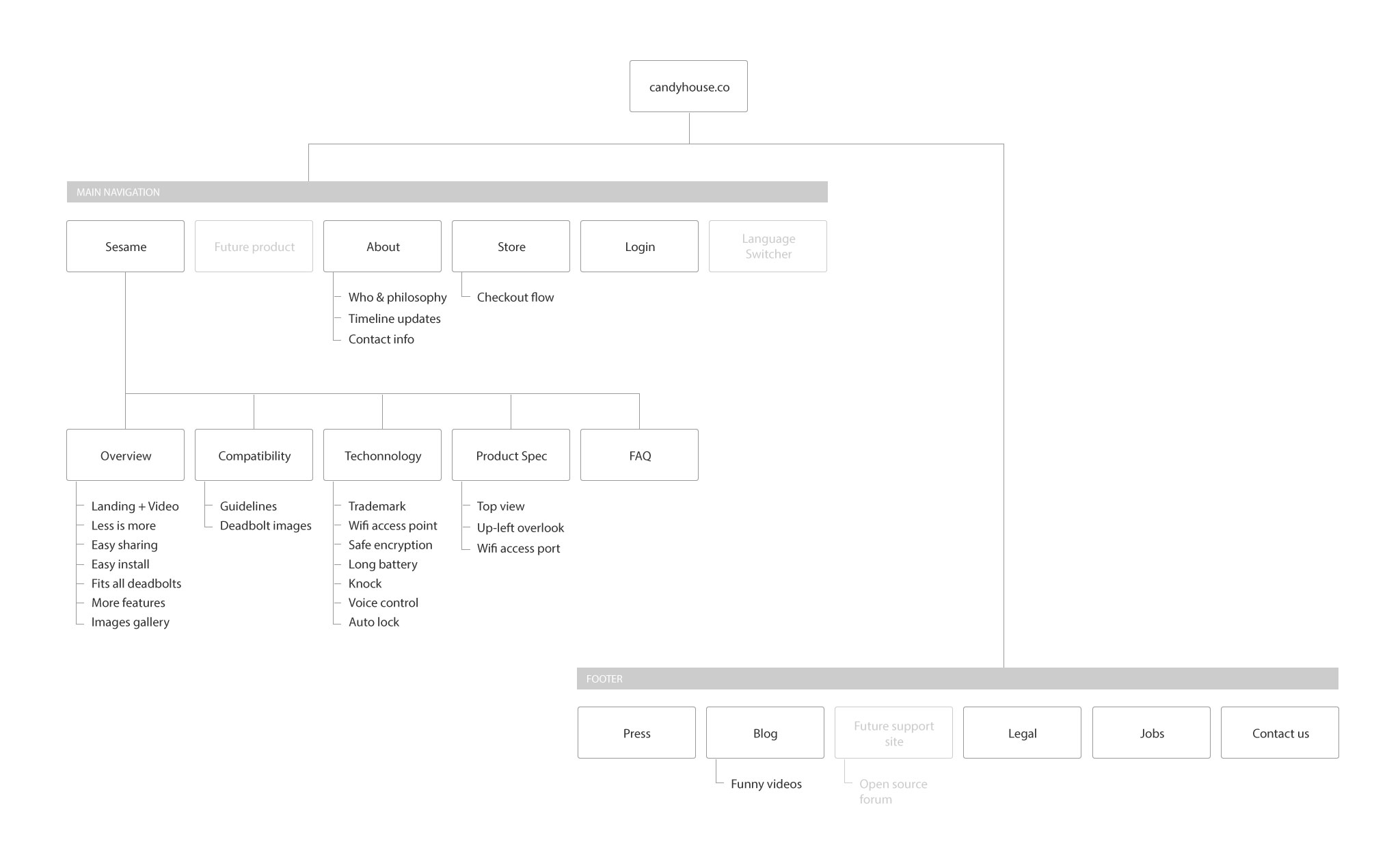
Architecture for the public website
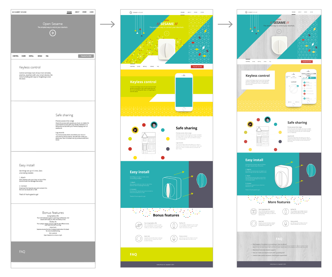
How the homepage evolved over time
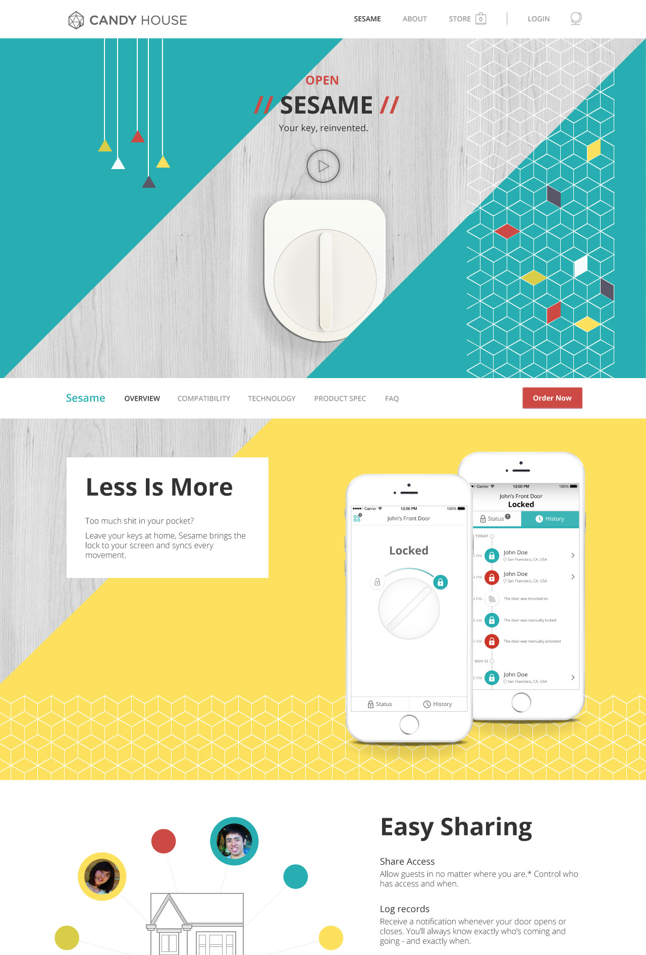

Homepage design for various screen sizes
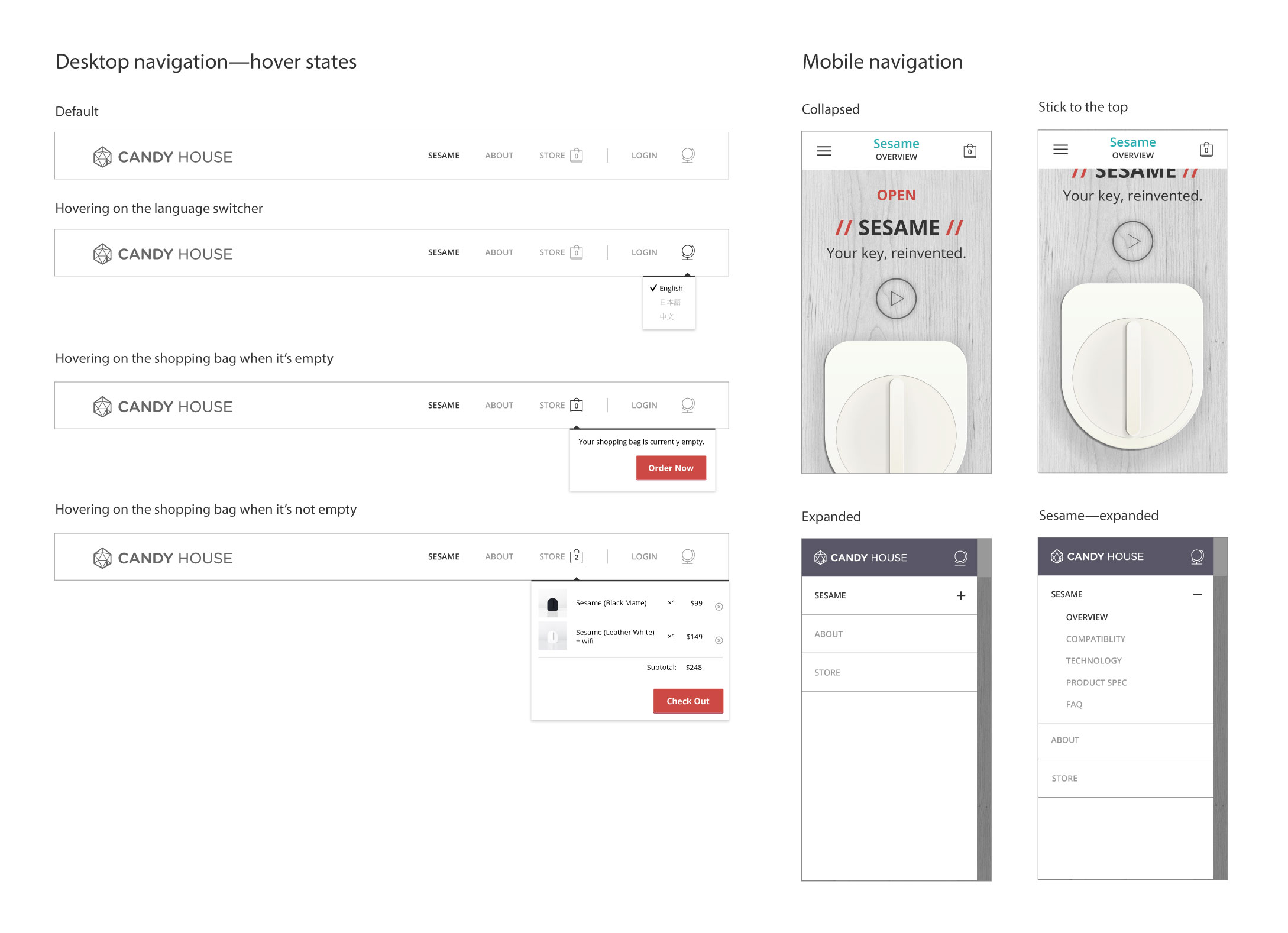
Navigation UI
Mobile app
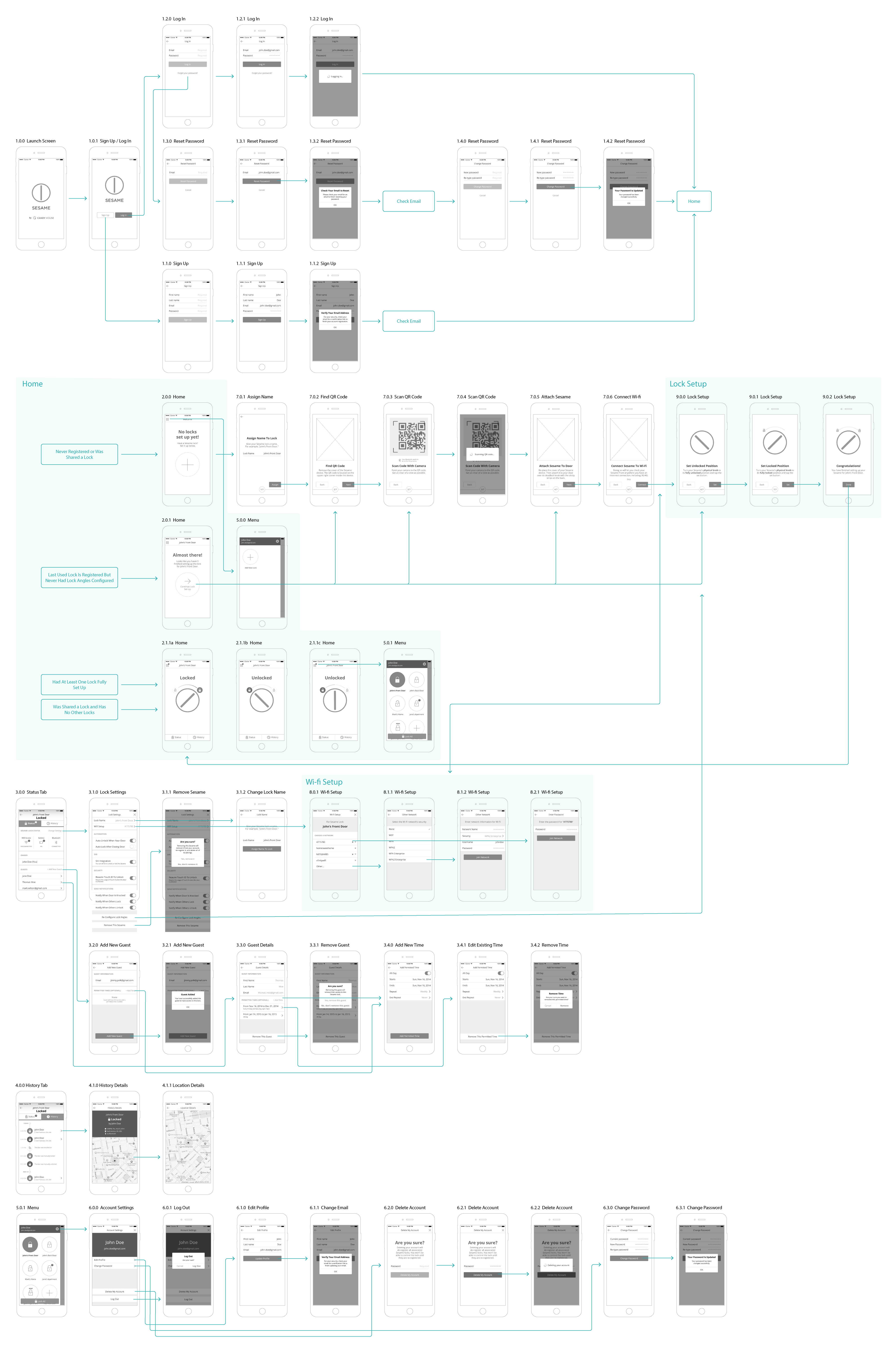
Teamed up with my design partner, we first drafted out a low-fidelity screen flow, which served as a blueprint for nailing down the required features with stakeholders. The key use cases we covered were:
-
Log in & sign up
-
Add new lock / lock configuration
-
Lock controls — lock & unlock
-
Lock settings
-
Add guests to lock with different access levels
-
Lock history
-
Account settings
Next, we created medium-fidelity wireframes with all the funtional details. In the end, I then translated the wireframes into high-fidelity mocks based on the brand guideline.
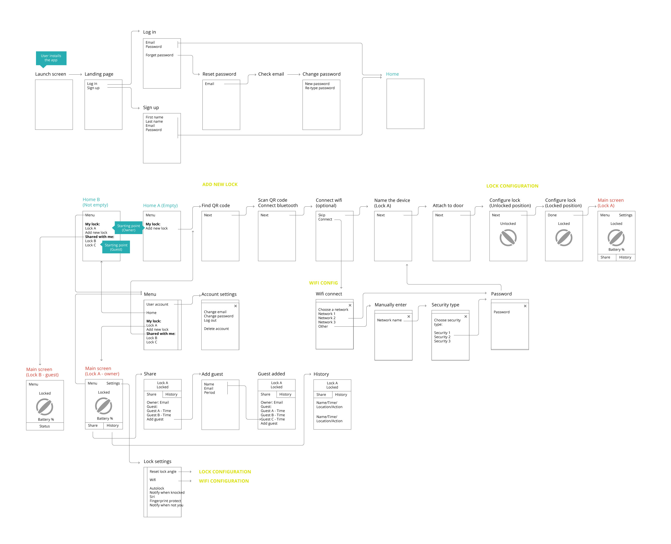
Low-fidelity screen flow
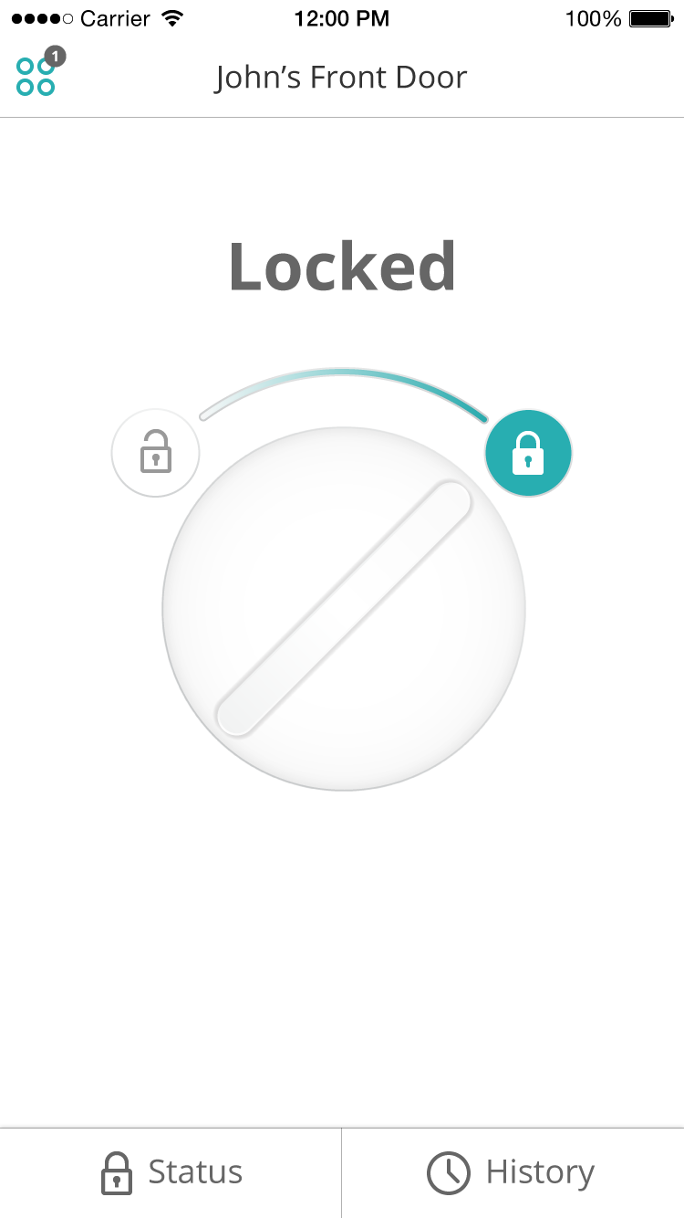
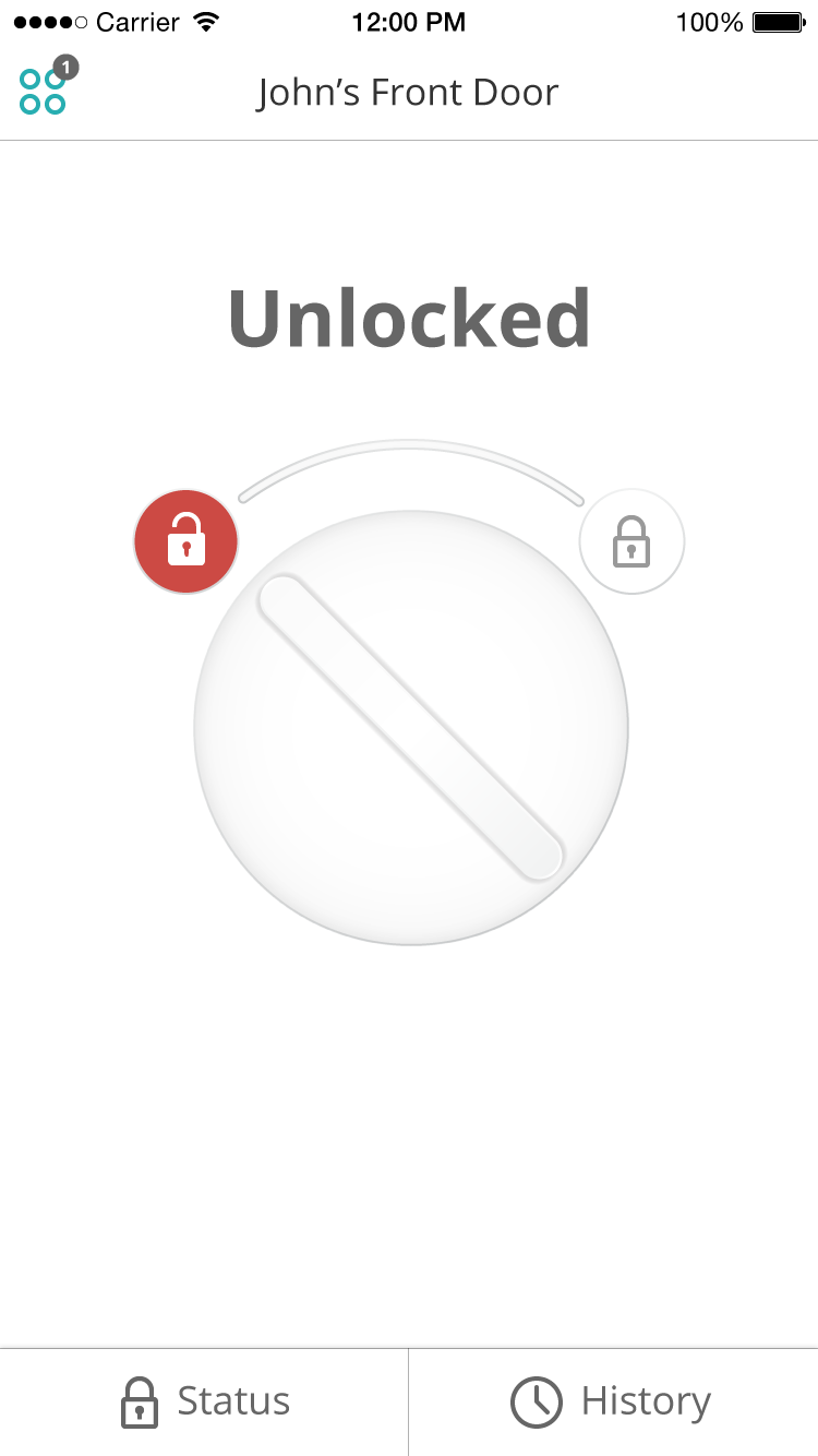
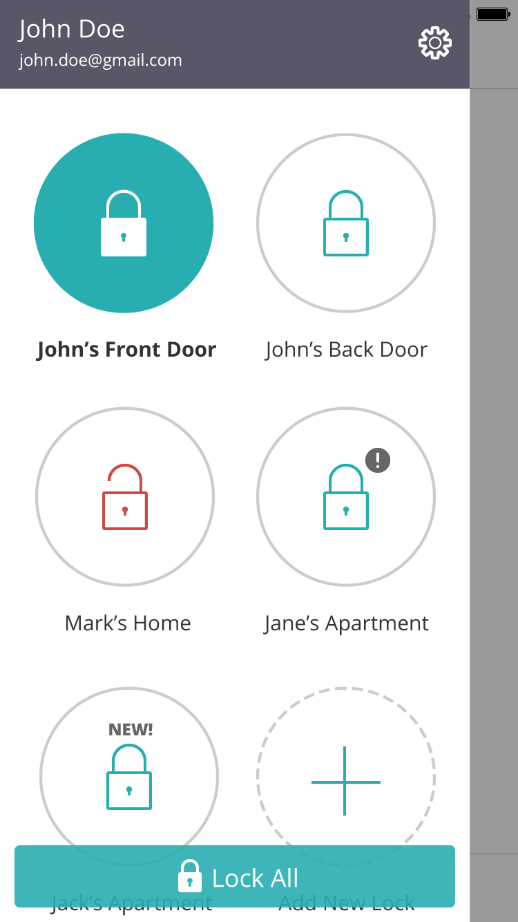
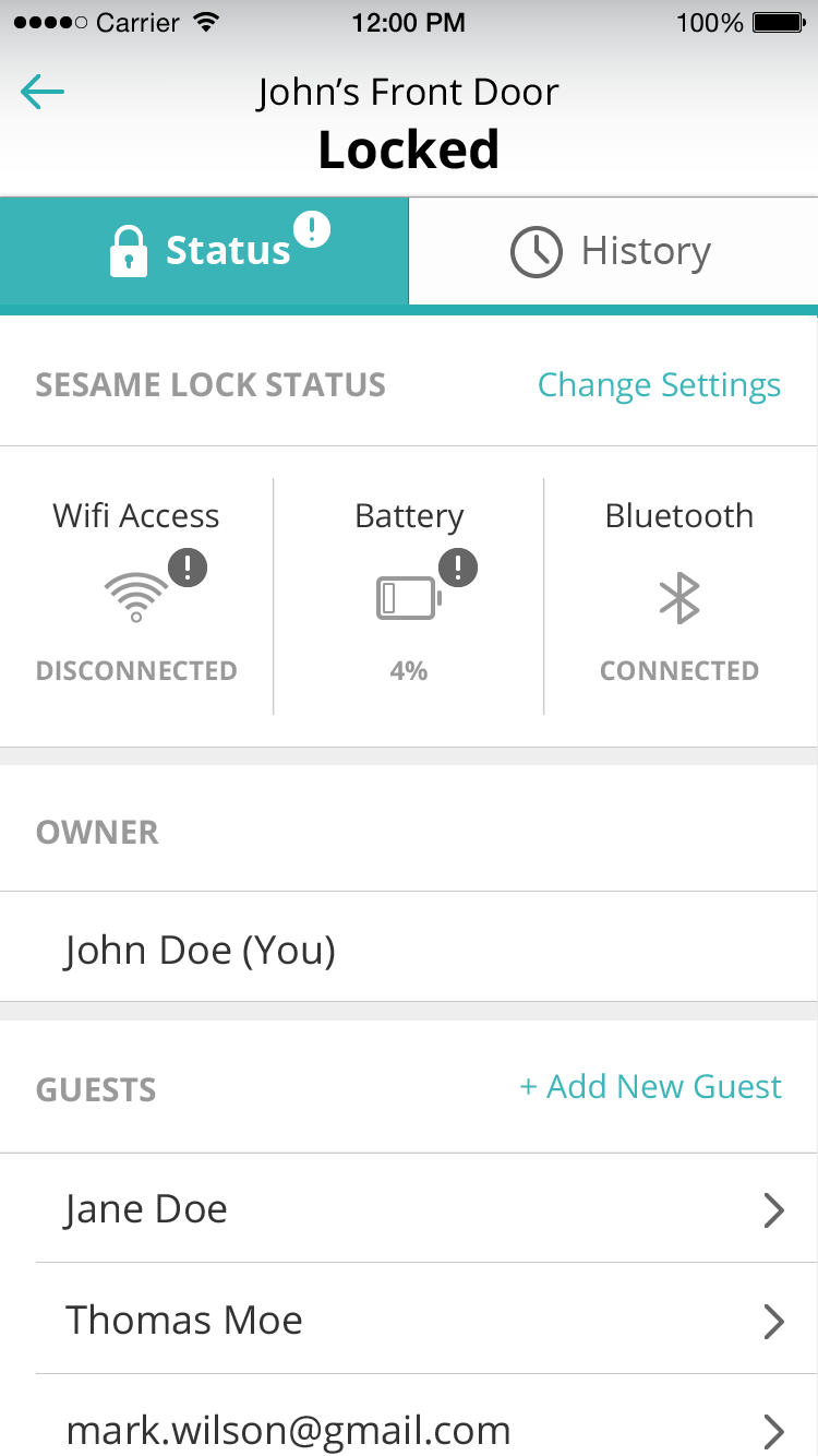
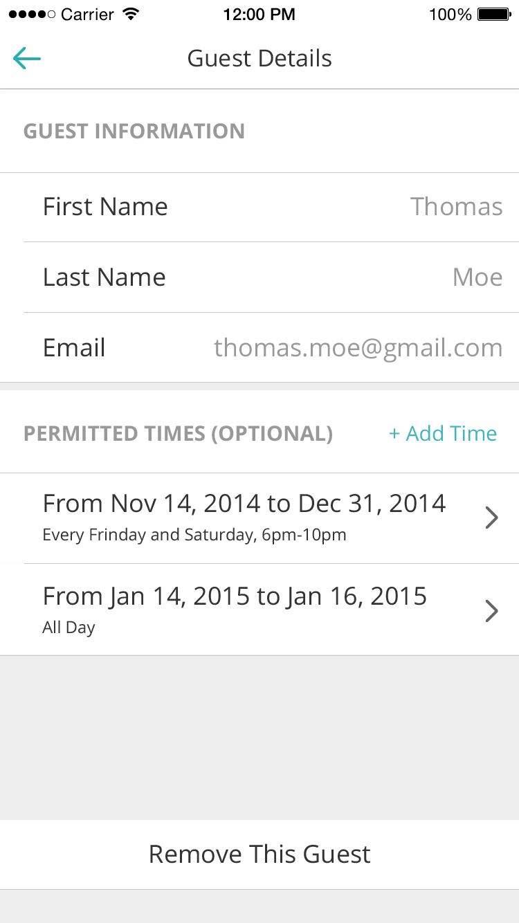
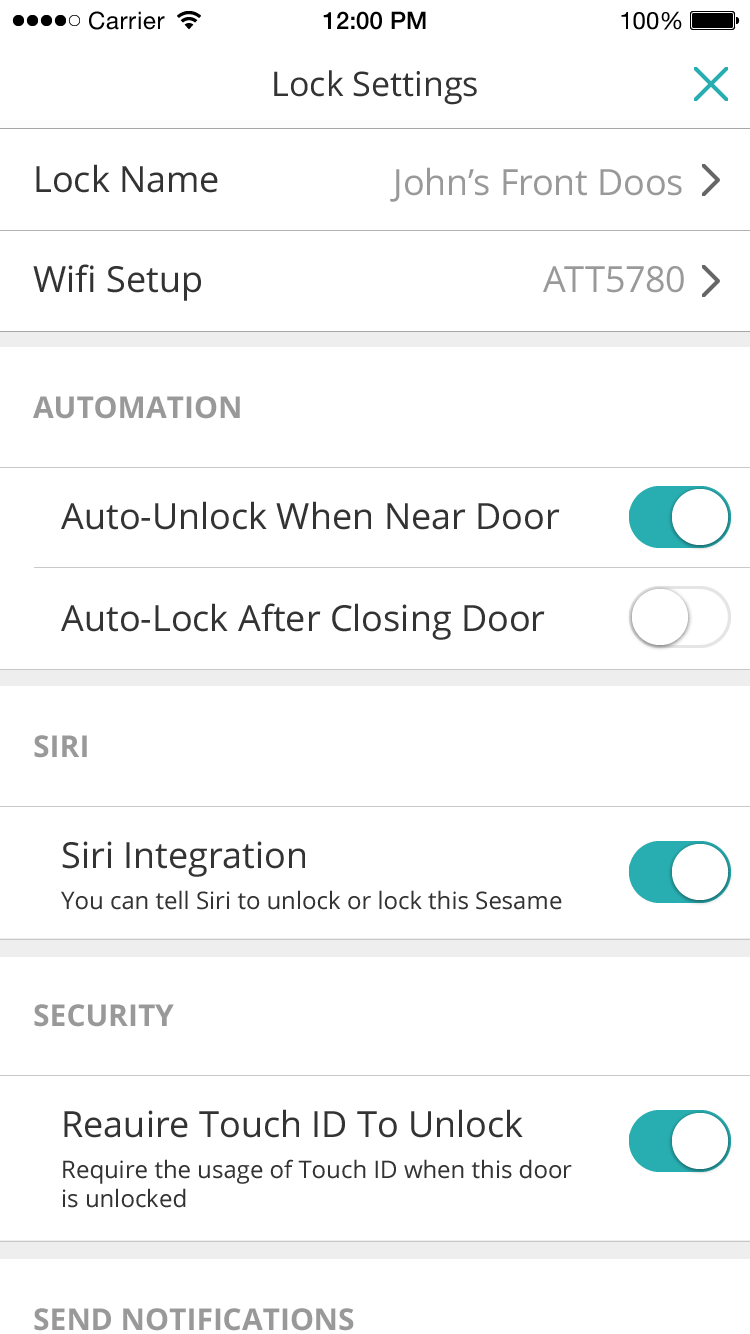
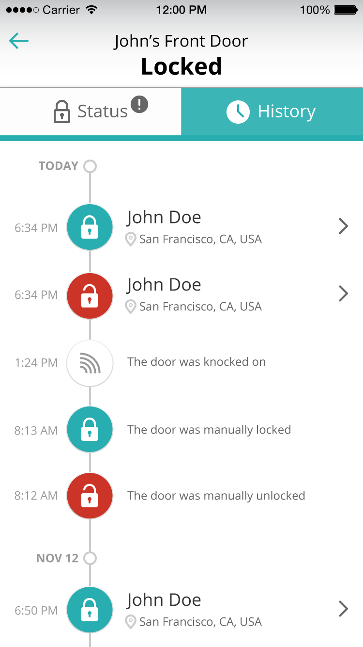
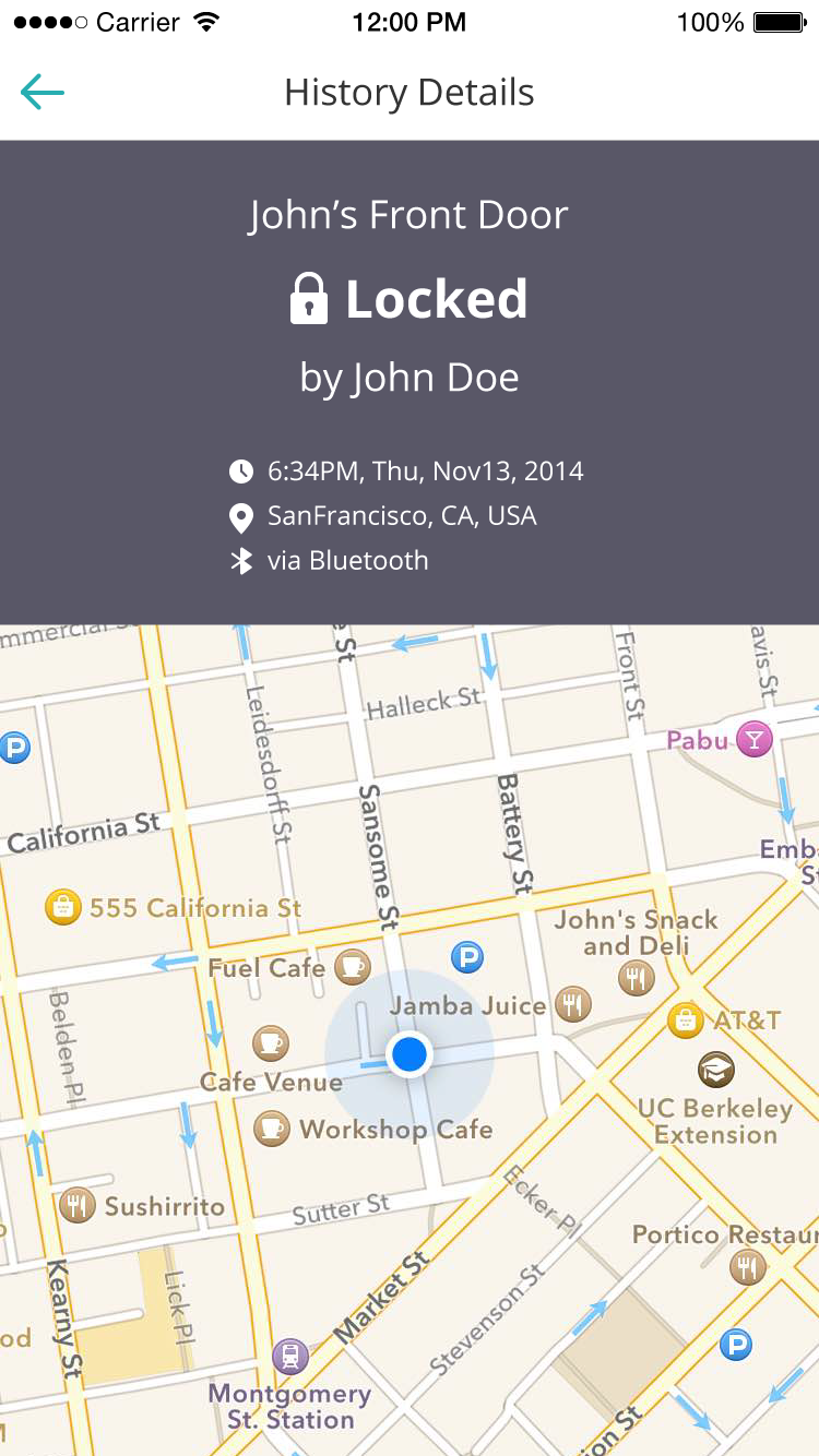
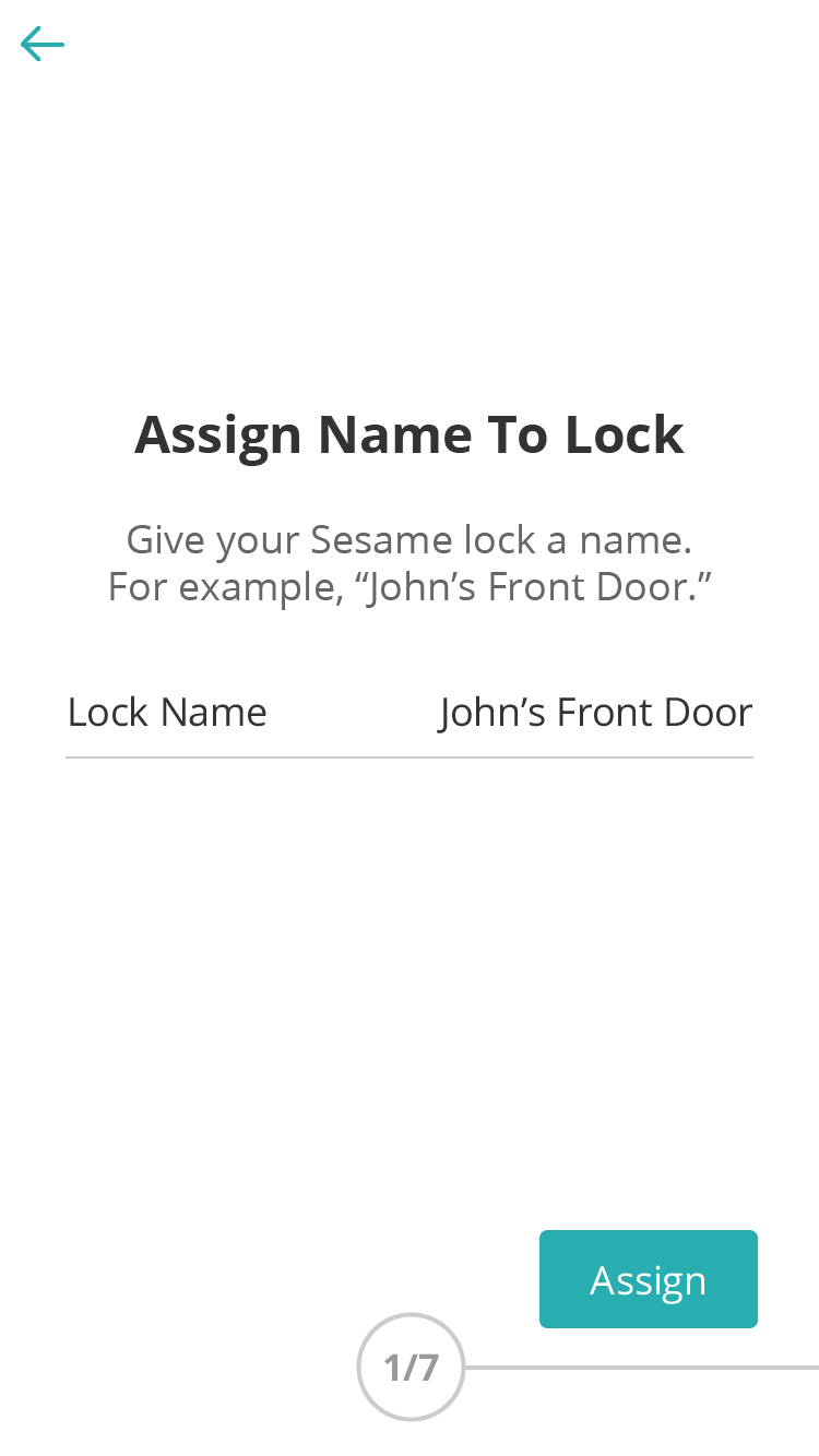
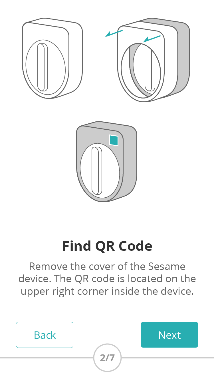
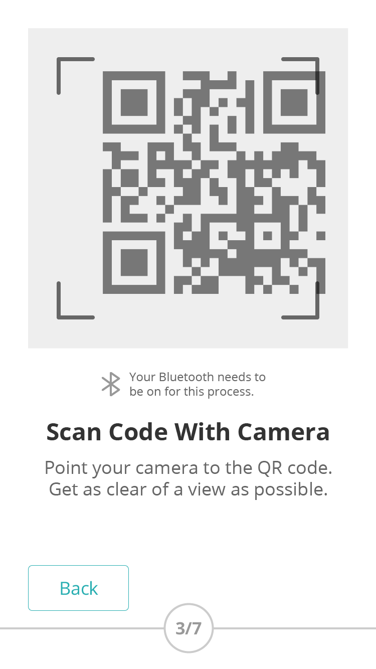
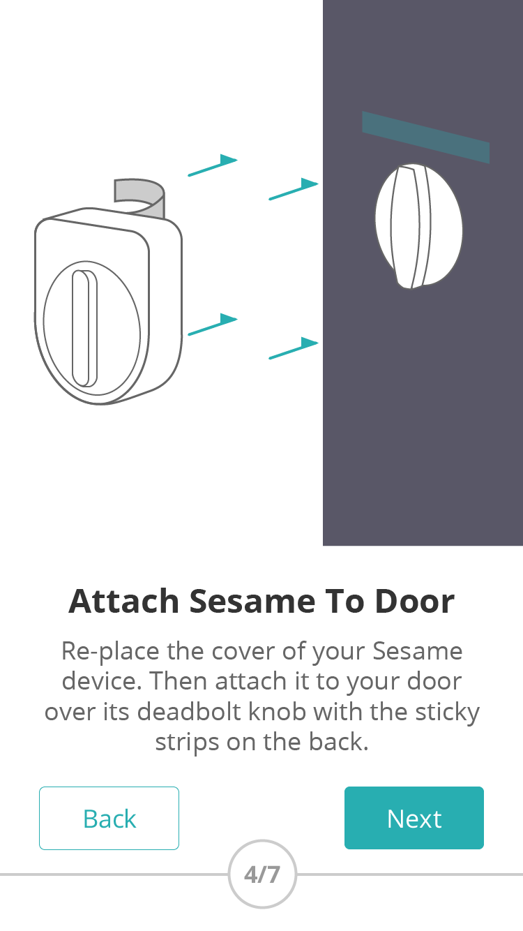
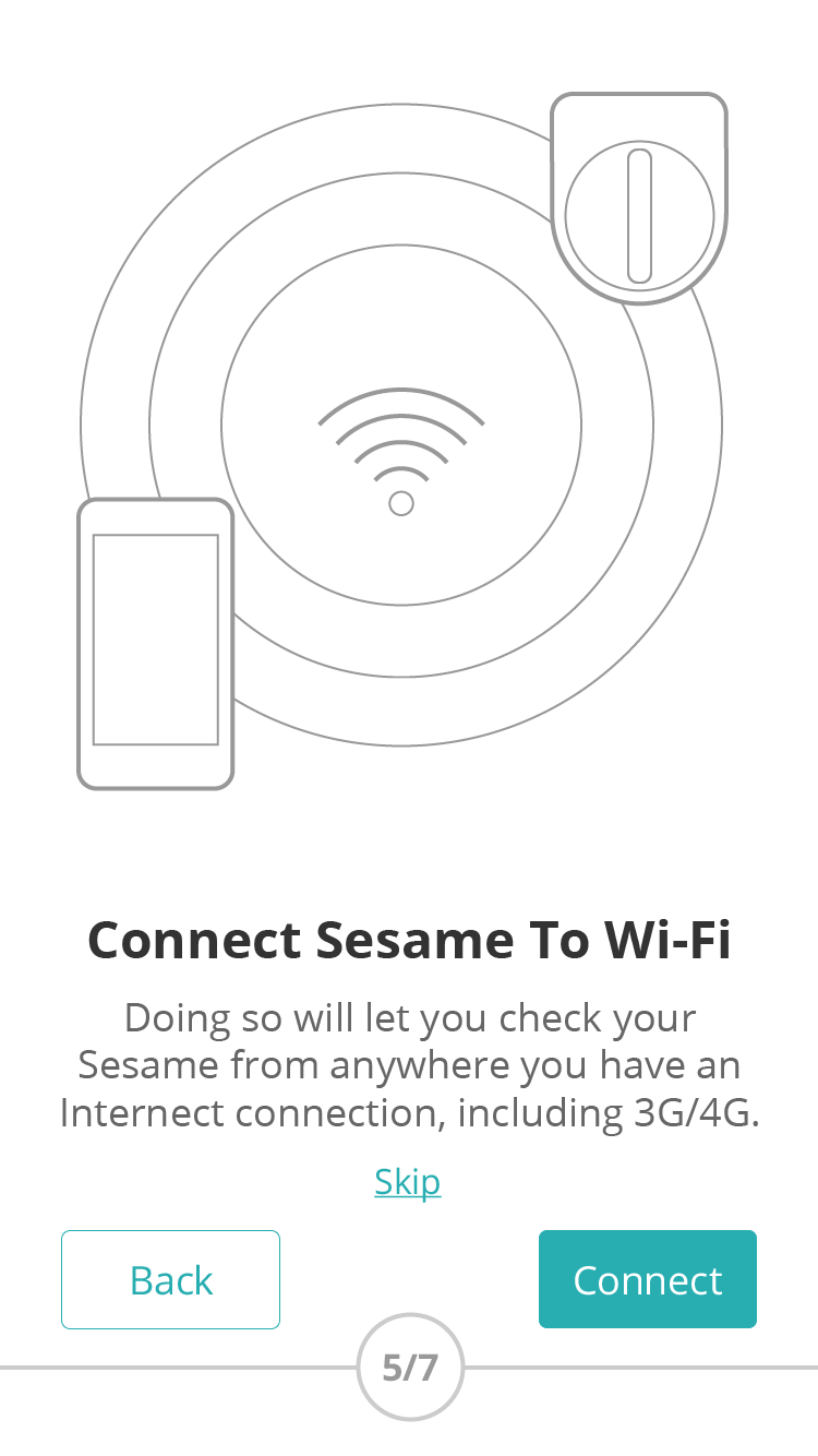
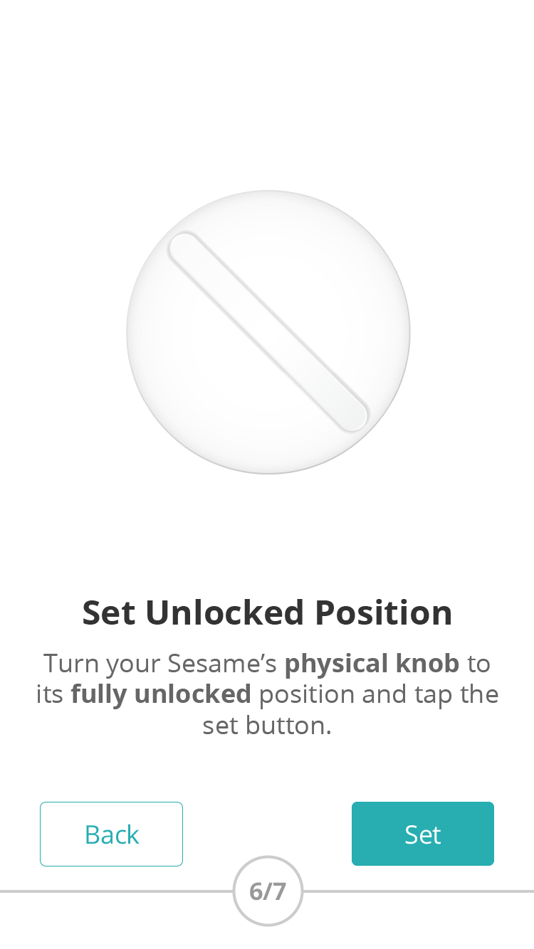
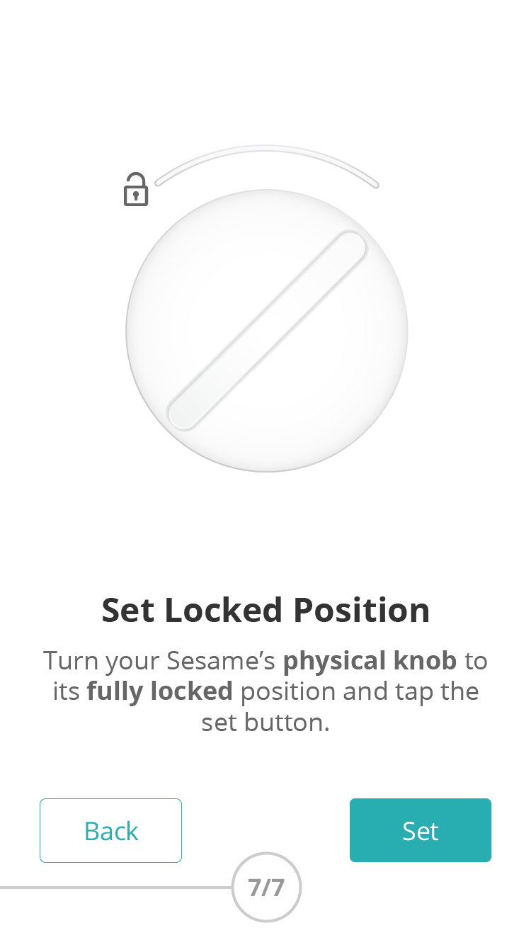
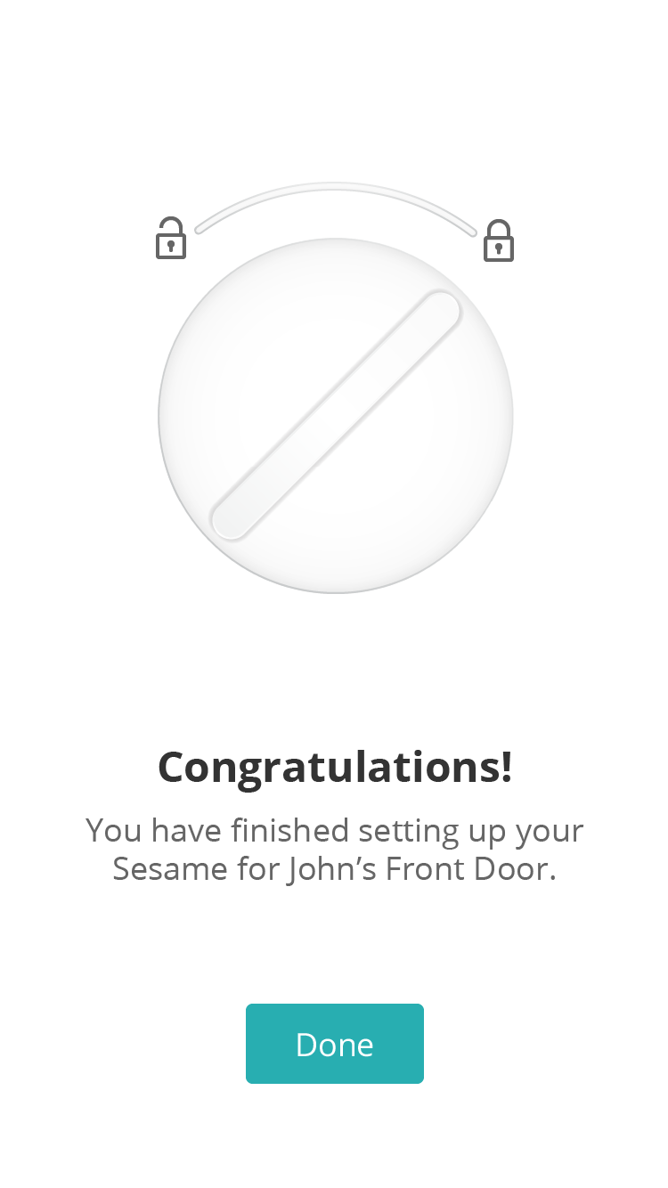
Selected hi-fidelity mobile screens
Result and reflection
It made me feel both excited and humble seeing that the Kickstarter campaign for Sesame was successfully backed within 9 hours after it got launched, and eventually hit 14 times more than the pledged goal of $100,000. It was fulfilling to be able to give an early-stage startup a hand and create something that propelled the company to the next level, but at the same time I knew that it’s just a start and there will be endless challenges ahead of us.
Working with Candy House also substantiated the dogma, “Time is money,” which is shared across most early-stage startups. It helped me reconfirm the value of setting constraints and making necessary compromises in order to keep things moving at a fast pace.
