Domestic Experience and Disaster Touring
Time: Nov. to Dec. 2011
Team: Dennis Ellis, Yuan Goa, Hongyuan Jiang
Role: Secondary research, Usability testing, Prototyping, Presentation
Design Methods: Affinity diagramming, Personas, Design sketches, Design ideation, Paper prototyping, Digital prototyping
Tools: Illustrator, PowerPoint
Overview
For a community undergoing a disaster, the domestic experiences there go through radical changes. Most visitors who arrive on the scene afterwards are interested in knowing how much has been impacted and how recover might occur. Visits of news reporters, journalists, government officials, and researchers might help the community raise the awareness of external aids, while visits of volunteer agencies could provide constant manpower to rebuild local residents' lives. We focused our design on an iPhone app to enhance visitors' touring experiences in disaster-hit areas by navigating them through the paths of local residents' daily lives and providing timelines to contrast the pre-disaster, among-disaster, and post-disaster living conditions. We intended to increase the empathy among visitors, help people imagine the inextricably intertwined fates of humans with each other, which might lead to positive circles of more mutual helps and cherishing. This design was aimed to solve the challenge of CHI 2012 Student Design Competition, "Domestic Experience Design", in which the main idea was to develop and share awareness, understanding, and appreciation for domestic experience as it relates to space, place and threshold.
Design Process
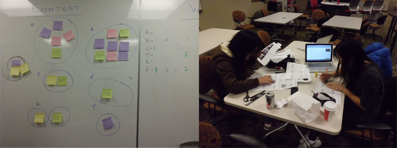
We firstly reframed the problem by using affinity diagram to contract our problem space from several possible contexts to rebuilding the memory of a post-disaster community. We then moved to do researches about the domain, which pointed out that "disaster touring" has become a common phenomenon in many real cases of natural disasters, which could foster embodied memories for both firsthand survivors and tourists come afterward. Those insights led to ten concepts and finally were narrowed down to two of them. "Filter and lens" provided users chances to view from residents' perspective, and "time/space contrast" offered timelines to contrast pictures from different moments. Usability tests were performed with a low-fidelity paper-prototype and we created another high-fidelity digital protorype after adjusting some details based on the test results.

Final Concept
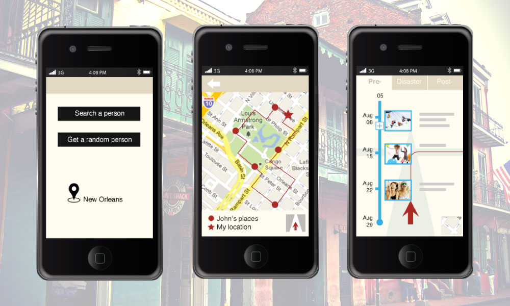
To organize a tour, a user could choose either "search a person" if he knows a resident there or "get a random person" if he has no specific target (left screen). The system will then automatically generate a route on the map view (middle screen) based on the most-visited places of that person . When changing to street view (right screen), as the user move from place to place, pictures belong to the user's current location will update on the timeline. The user could also expand the timeline by clicking the plus sign to see more pictures. The street view provides three modes to contrast the pre-disaster, among-disaster, and post-disaster views of a disaster-hit area.
