-
About the class
CodePath holds free, intensive 8-week bootcamps for senior designers who are interested in learning iOS development. The course empowers designers to modify the view and animation-related code for iOS Swift prototypes as well as production apps.
-
Role
iOS Swift development, interaction design, visual design
-
Timeline
Feb. 2015 to Mar. 2015
Context
As more and more people with engineering backgrounds start to appreciate and learn about design, the same trend is happening in the opposite direction as well. With the introduction of Interface Builder within the iOS development tool Xcode, the coding environment for designers to learn mobile development has become more friendly and familiar.
Having basic knowledge of front-end web development, it’s easy for me to see how learning to code native apps can benefit my workflow and enhance my collaboration with developers. I was always attracted to the idea, but not sure where to start until I ran into CodePath. Thanks to the class, I’m now able to start the journey of learning Swift with no fear!
Class overview
The class I attended was 8 weeks long. Each week was comprised of a 2-hour lecture on one night and a 2-hour lab time on another night to reinforce what we just learned. There were weekly assignments in the first 5 weeks, and also a final group project presentation at the end of the class.
Weekly assignments
The weekly assignments (see my GitHub page for full assignments) focused on recreating views, navigation, transitions, and animations of some popular apps by coding in Swift on top of pre-made assets. It started with basic tasks like adding hotspot links, up to code-heavy customizations such as creating custom transitions between different screens. These exercises helped our class build the foundation for making their own app in the final project.
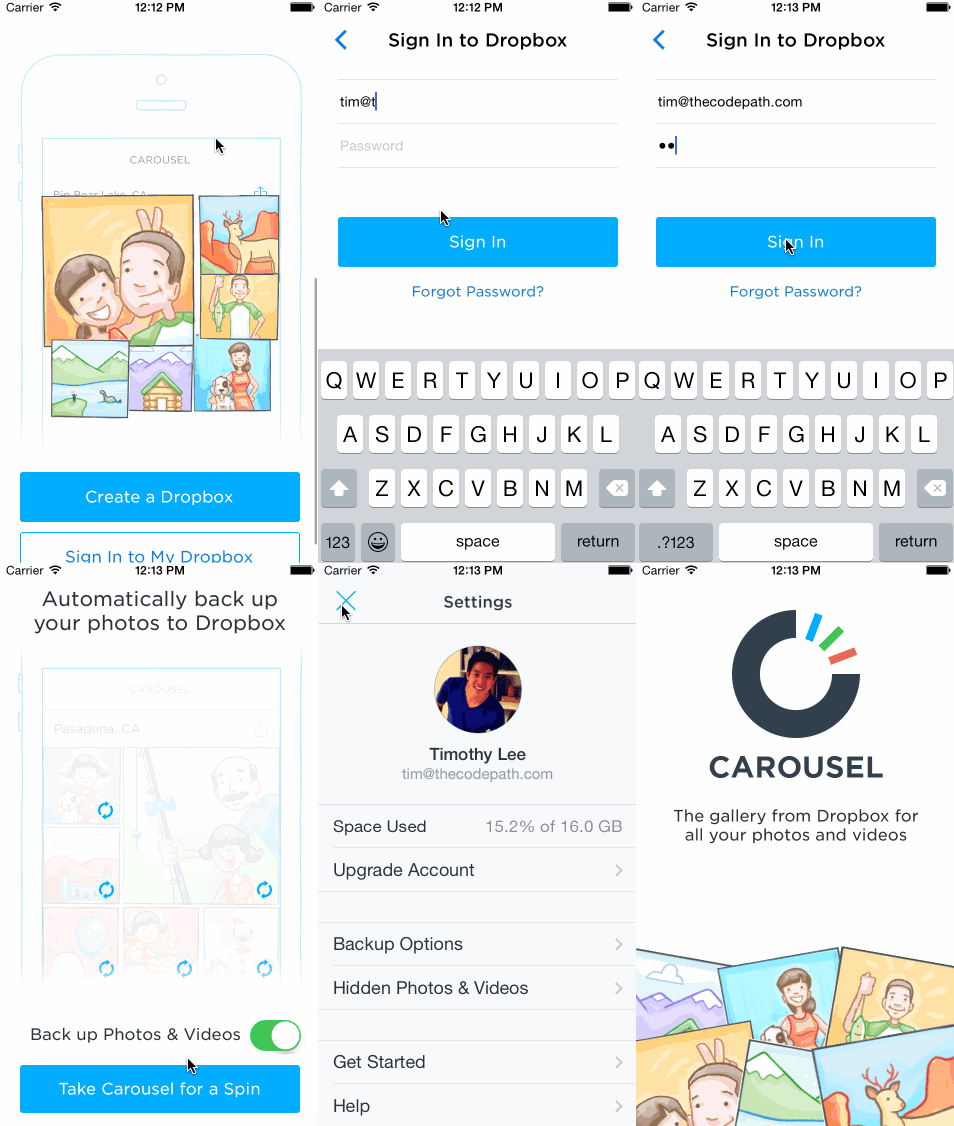
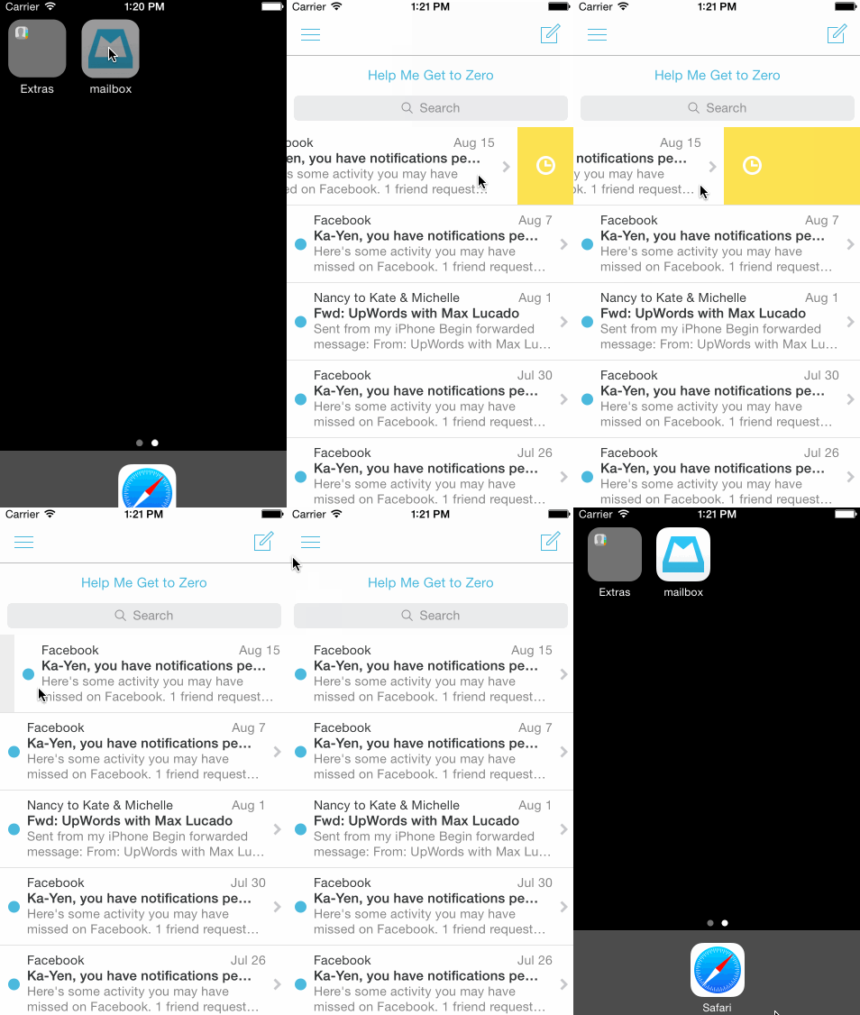
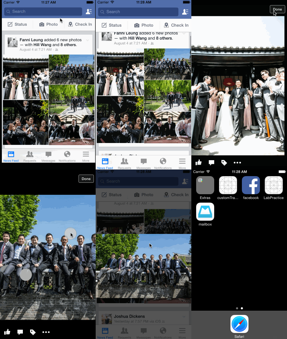
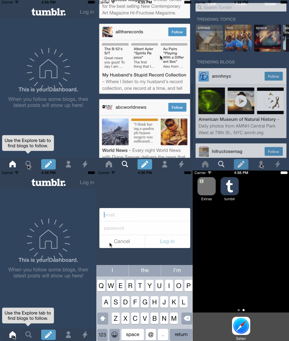
Weekly assignments
Final project
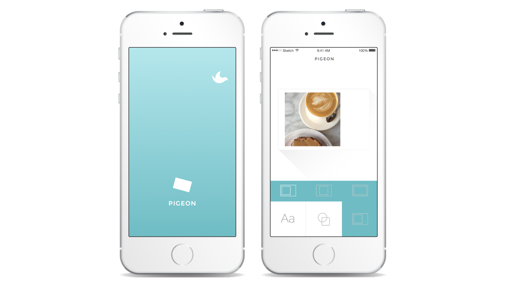
Having teamed up with two other designers who were also travel enthusiasts, my team decided to build an app called Pigeon to help travelers send customized postcards made from the photos they took. Starting from scratch, we spent the first week researching similar apps, drafting out the screen flows for our own app, and applying visual design. We then deivided and conquered the development of the features in the remaining 3 weeks building the app with Xcode.
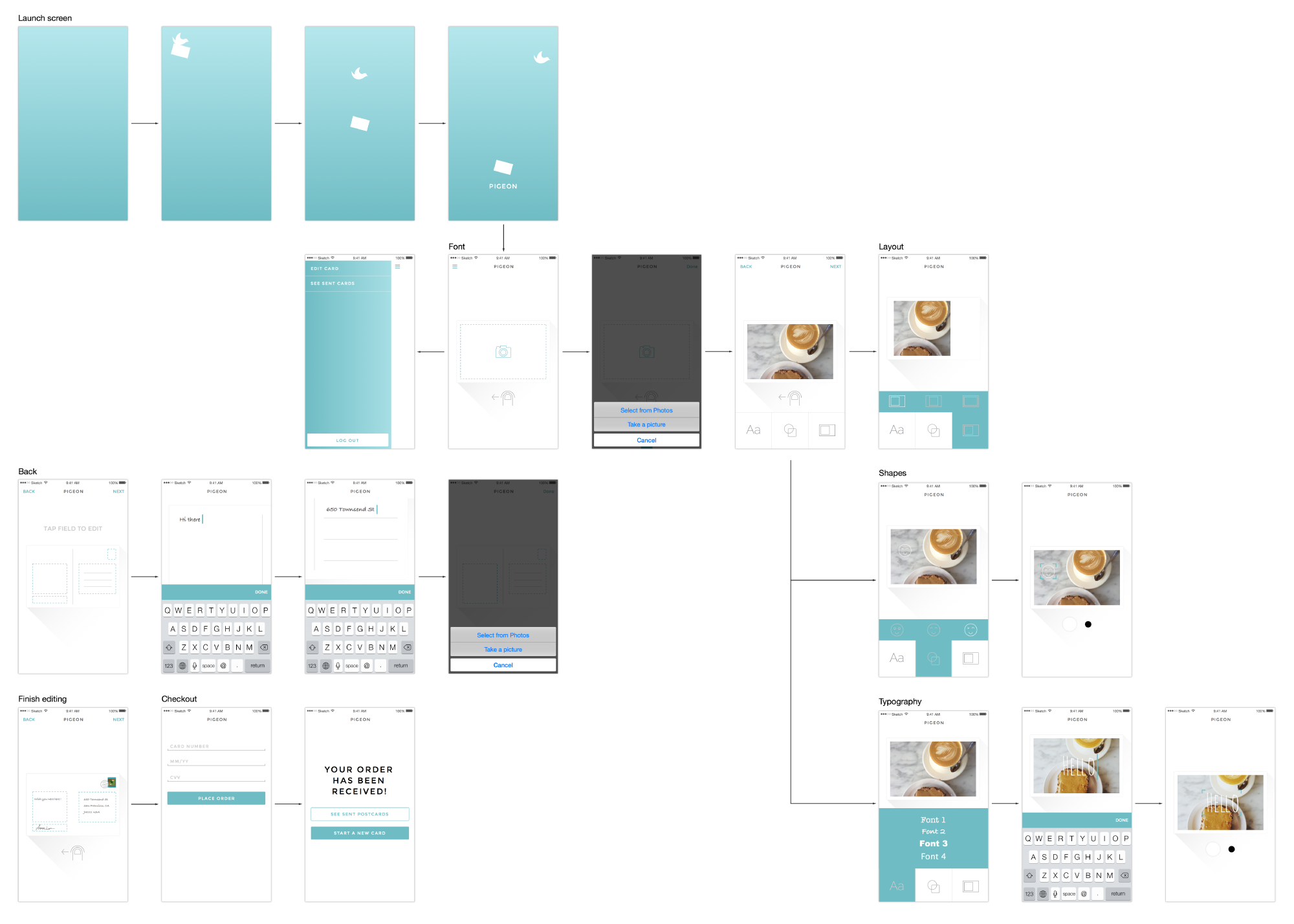
Screen flow of the app Pigeon
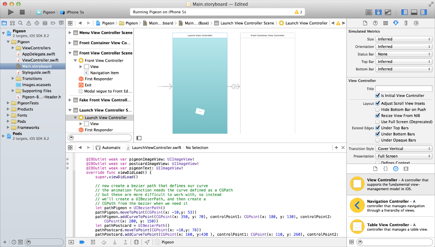
Xcode environment
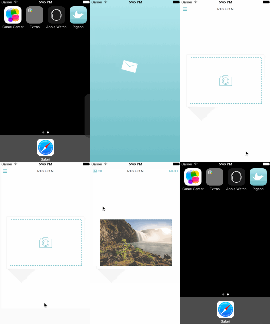
Animation for the launch screen
Reflection
It was an intense but wonderful 8-week experience switching back and forth between the left and right brain. It made me understand the development process of native apps better as well as appreciate the skills of developers even more.
In terms of how I would incorporate Xcode into my day-to-day design process, I don’t have an answer yet. Although I think the visual side of Xcode has some potential to become the bridge between designers and developers, there are a lot of other mobile prototyping tools out there, such as Framer.js and Pixate, that can achieve similar effects with less time. Prototyping with Xcode is wonderful in the sense that it’s easier to access some APIs to make the app feel really realistic, but at the same time it requires a lot of time investment on debugging in order to make every logic perfect. That being said, I’ll keep track of what other designer-friendly features will be added to Xcode, but also keep my eye open to other tools designed specifically for prototyping.