-
About the company
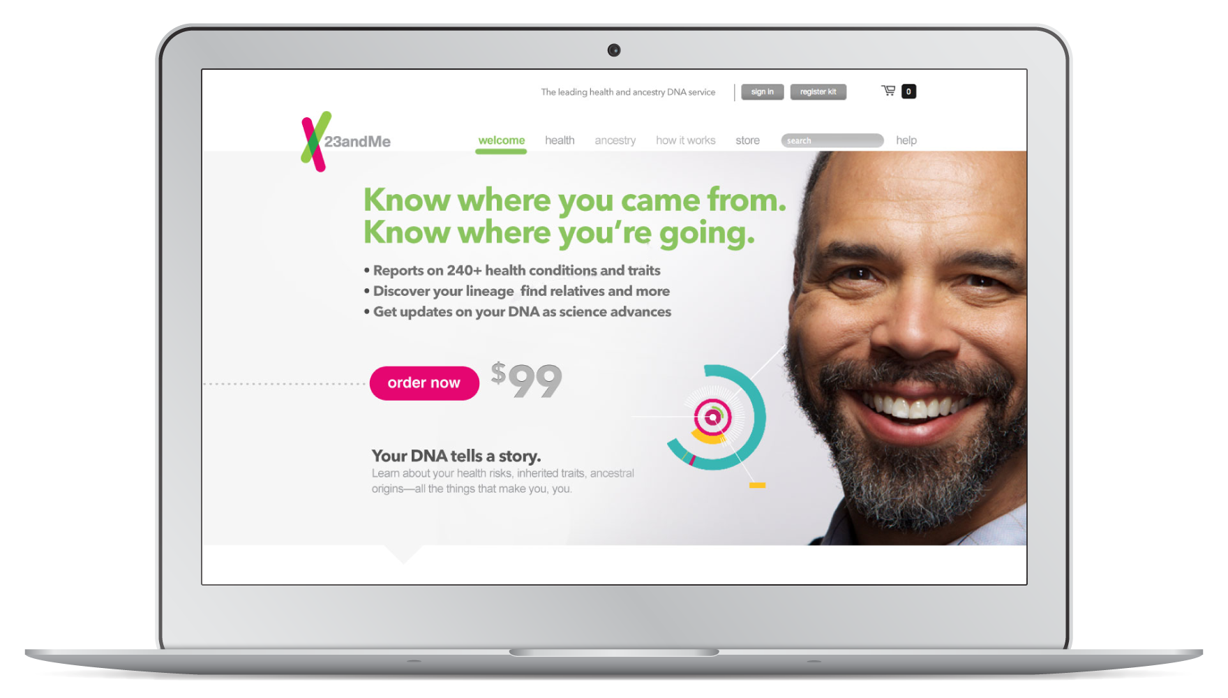
23andMe is a saliva-based DNA service. They provide genetic reports on customers’ ancestry, health insights and help them connect with their DNA relatives.
-
Role
Interaction design, visual design
-
Timeline
Jun. 2013 to Aug. 2013
Context
In the process of rebranding, 23andMe had worked with a design agency to set up a new branding style guide to be implemented on their packaging design and new TV campaign. The next step was to expand these rebranding efforts to all of their digital products.
I was brought to the team to revamp their public website. Working with another graphic designer, my main focus was to improve the user experience of their current checkout flow, extend the new visual direction onto multiple web pages, as well as convert the new design into responsive layouts.
Checkout flow
Identifying users’ pain points
Working with 23andMe's customer service staff, we consolidated the major complaints customers had when they asked for help at the call center.
Users’ main pain points
-
The current interface isn’t mobile friendly.
-
There is no way to order more than one DNA kit online within a single checkout flow, which has been a frequent ask from customers around holiday season.
-
People don’t know what to do next if they receive a kit order from another person, which causes a high dropout rate.
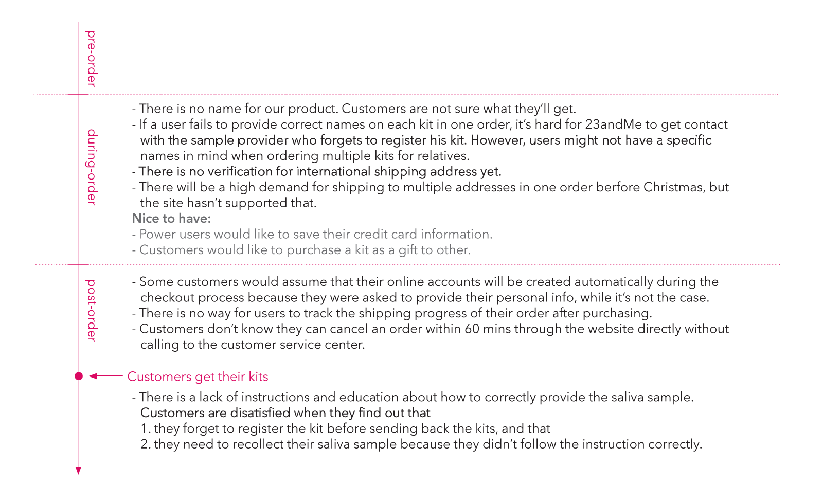
Pain points broken down by ordering statuses
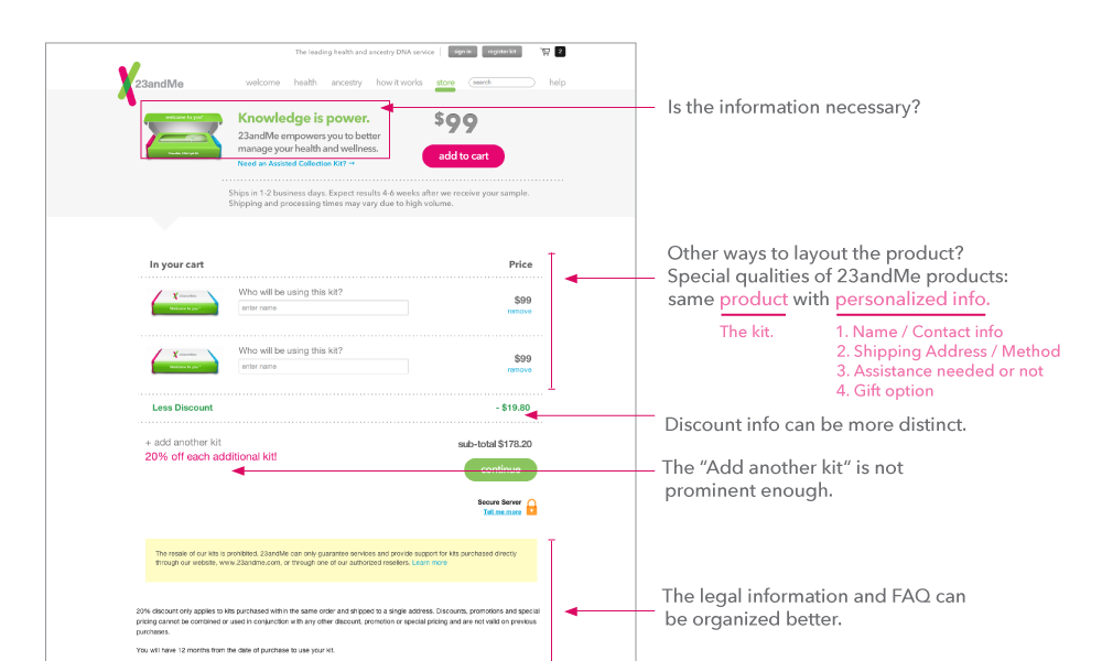
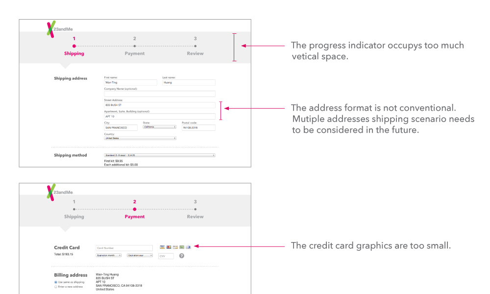
Evaluation of the current checkout flow
Wireframing for moblie
Since mobile devices have a lot more constrained screen space, I did a few wireframe explorations to see how we could simplify multiple check-out steps into one continuous flow.
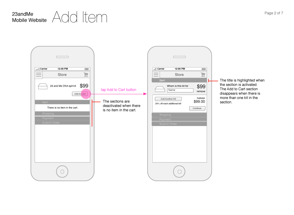
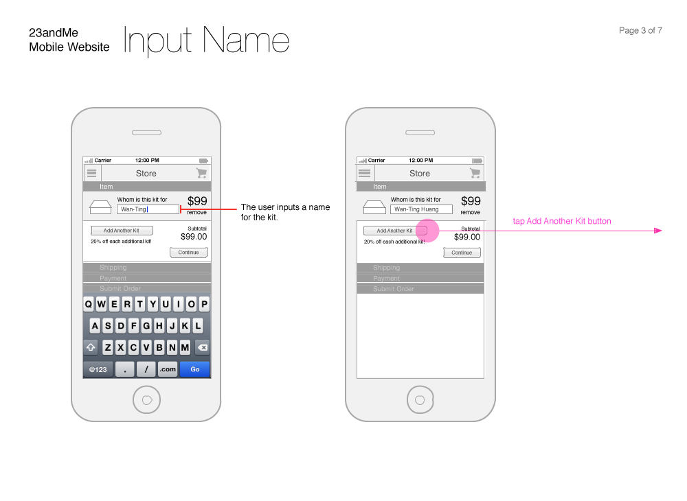
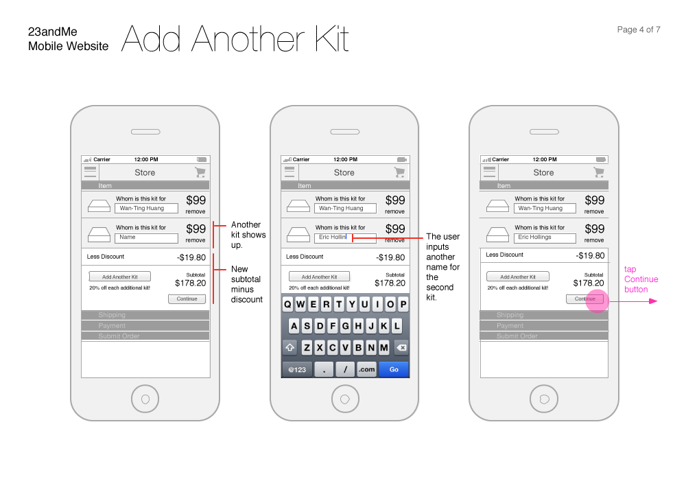
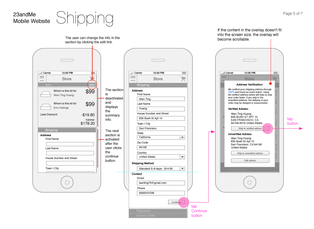
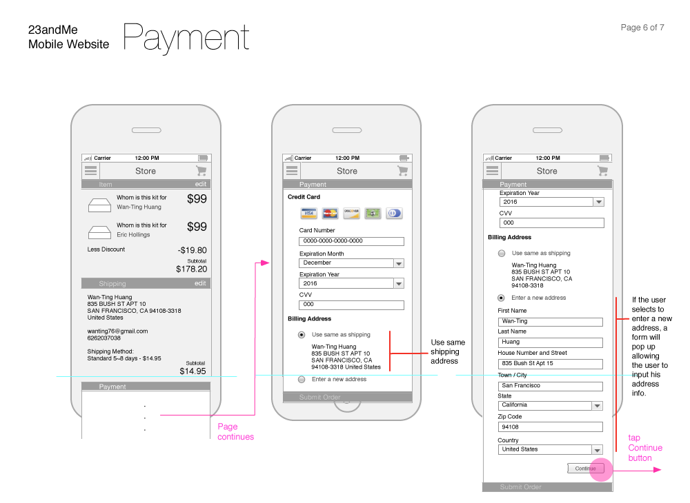
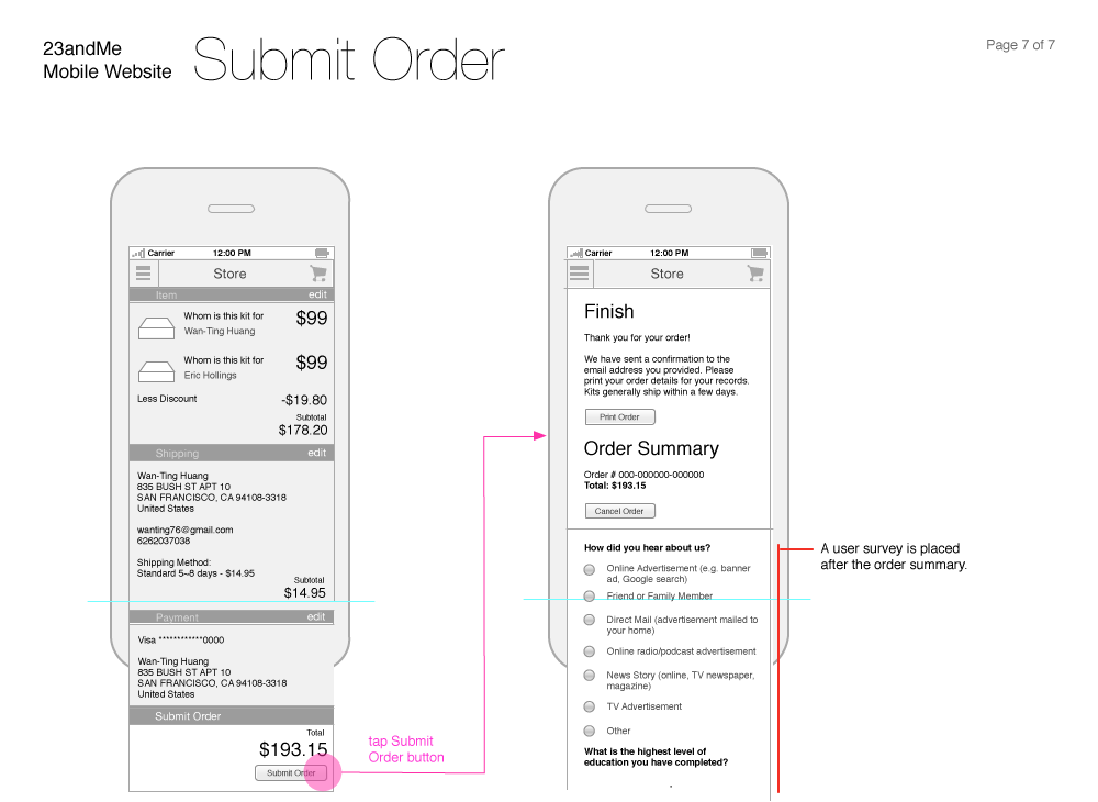
Wireframes for the checkout flow on mobile
Tackling new use cases
Based on users’ pain points, we narrowed down our design focus to adding multi-address shipping and gift message capabilities.
The design for allowing users to ship to multiple addresses was tricky, because we had to accomodate the "many-to-one" scenario, which is to match multiple kits to the same address. But at the same time, we didn’t want to overcomplicate the process by forcing users to create an account to save all the addresses they had entered before.
I referred to a couple nicely-designed checkout flows from other e-commerce websites, created screen flows iteratively and worked with the team to finalize interaction details. In the end, we landed on a linear checkout flow that allows users to reuse the addresses they just inputted without opening an account.
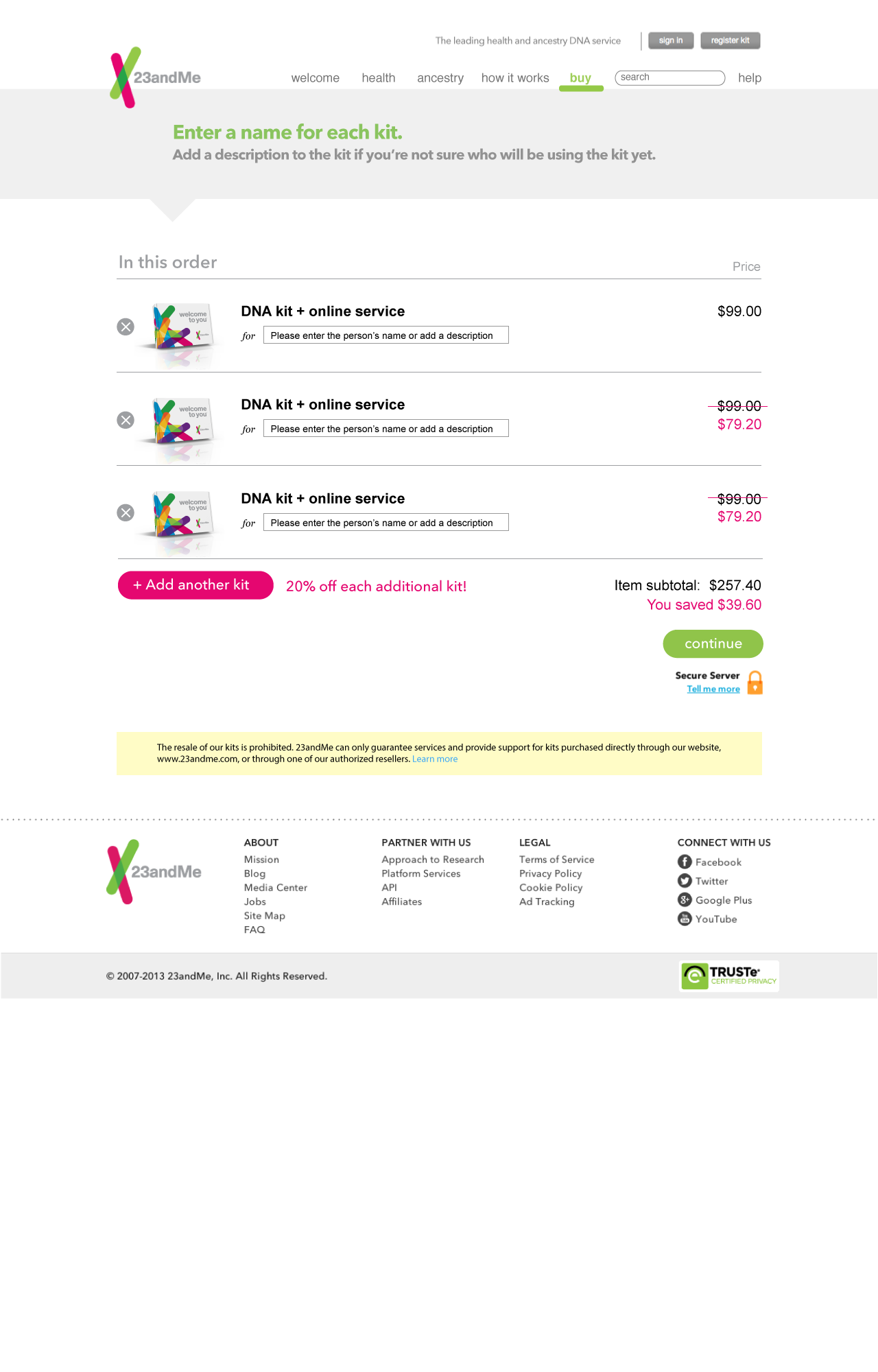
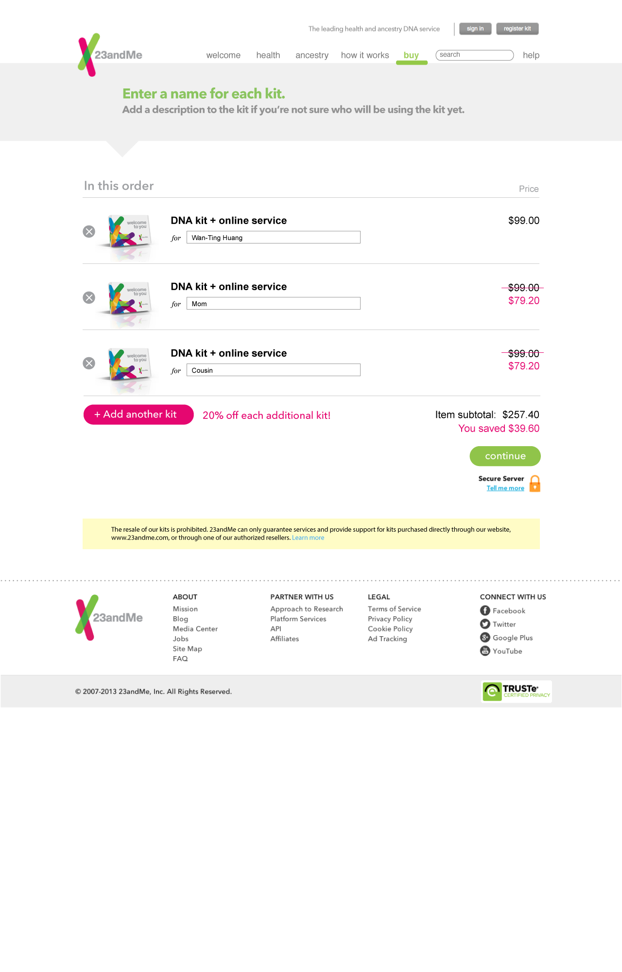
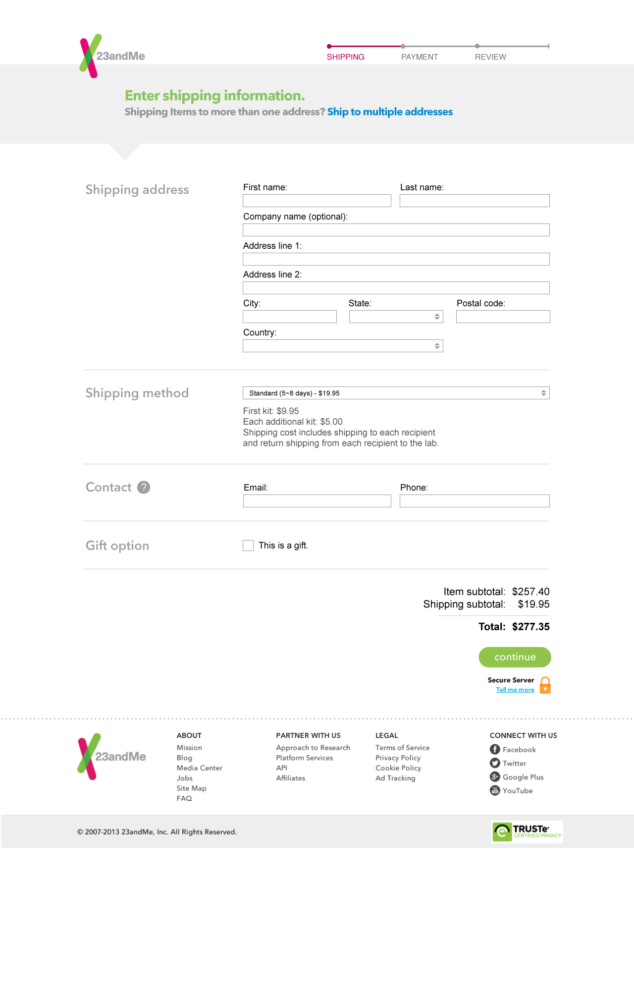
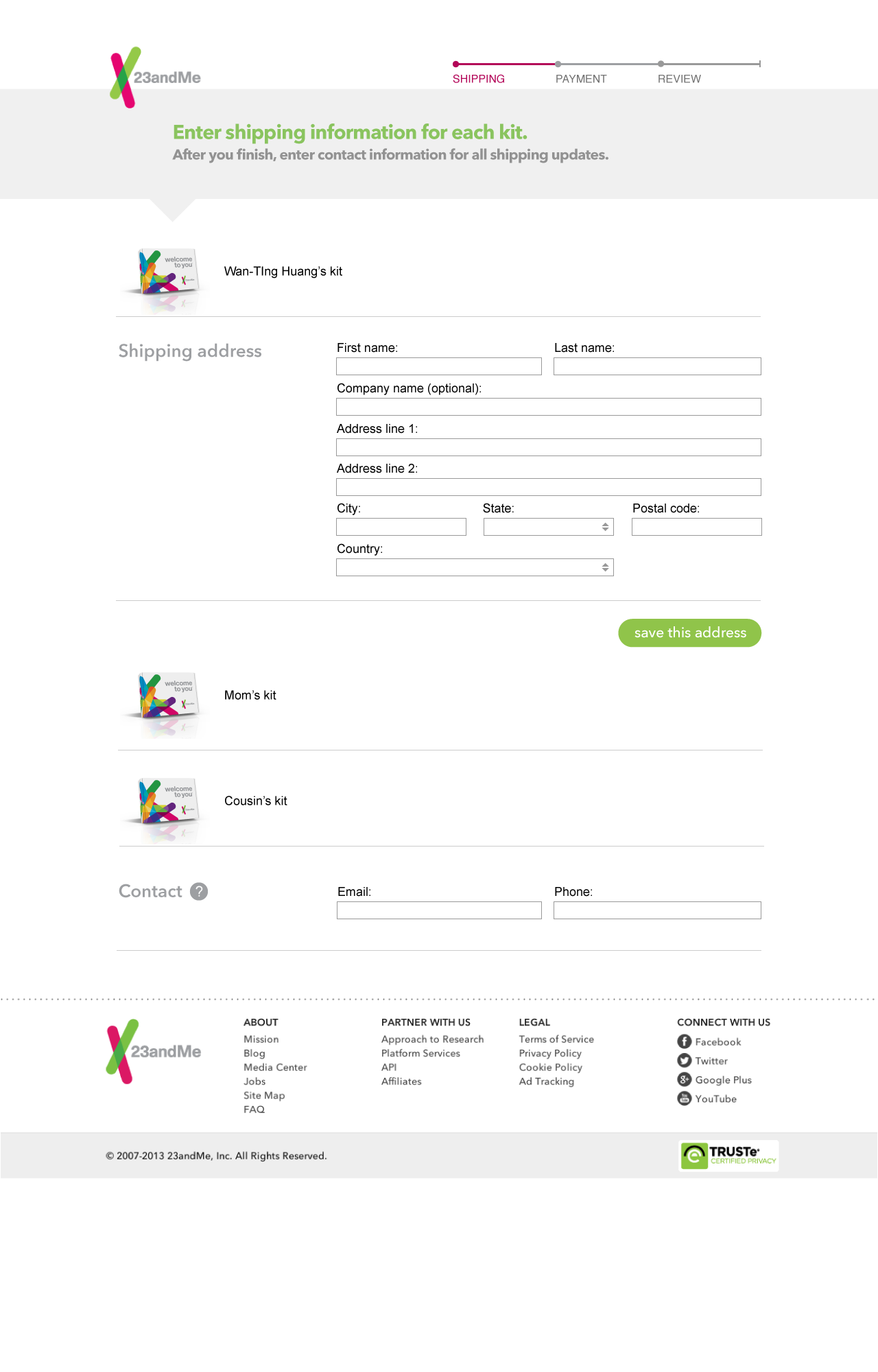
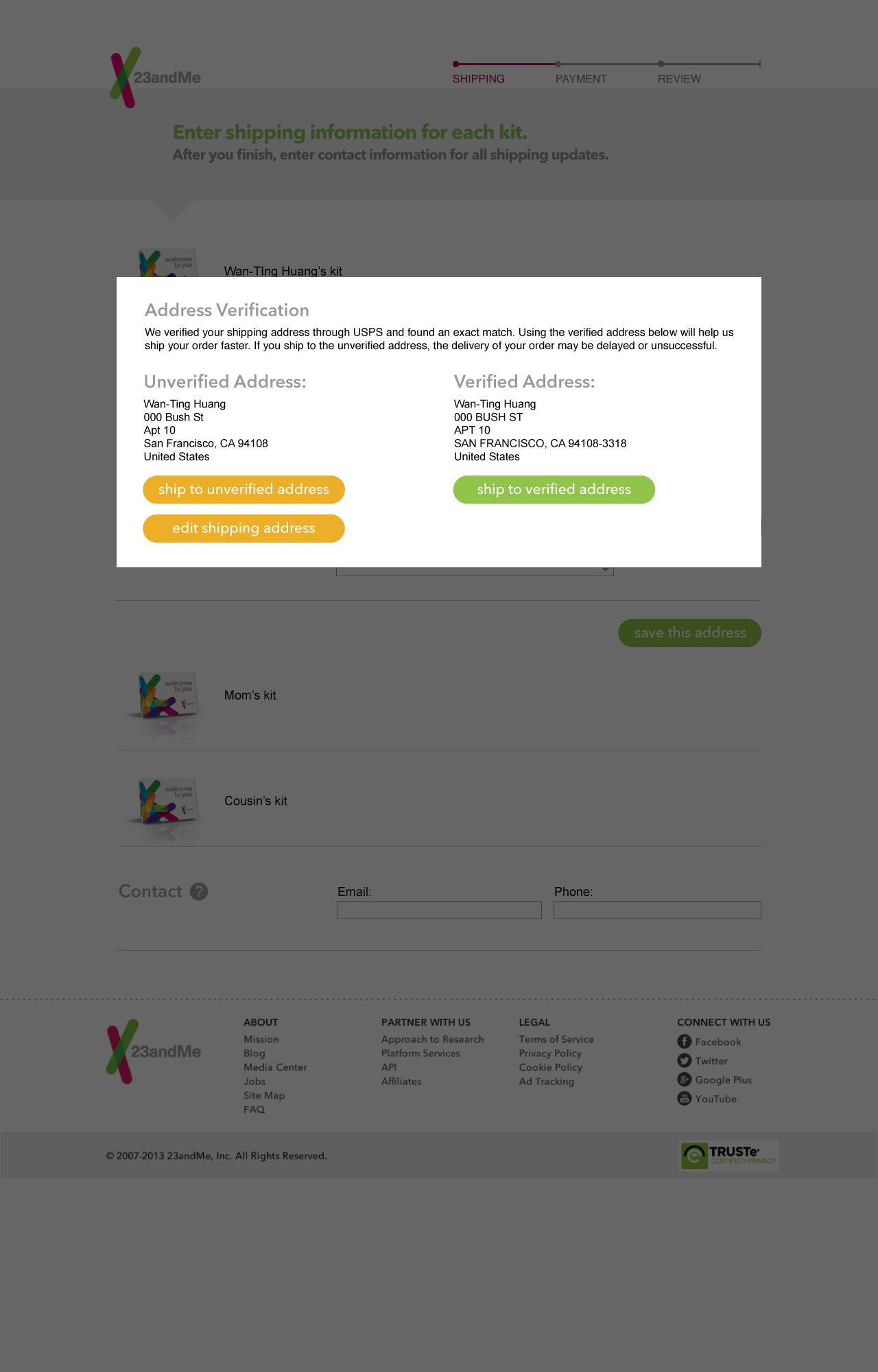
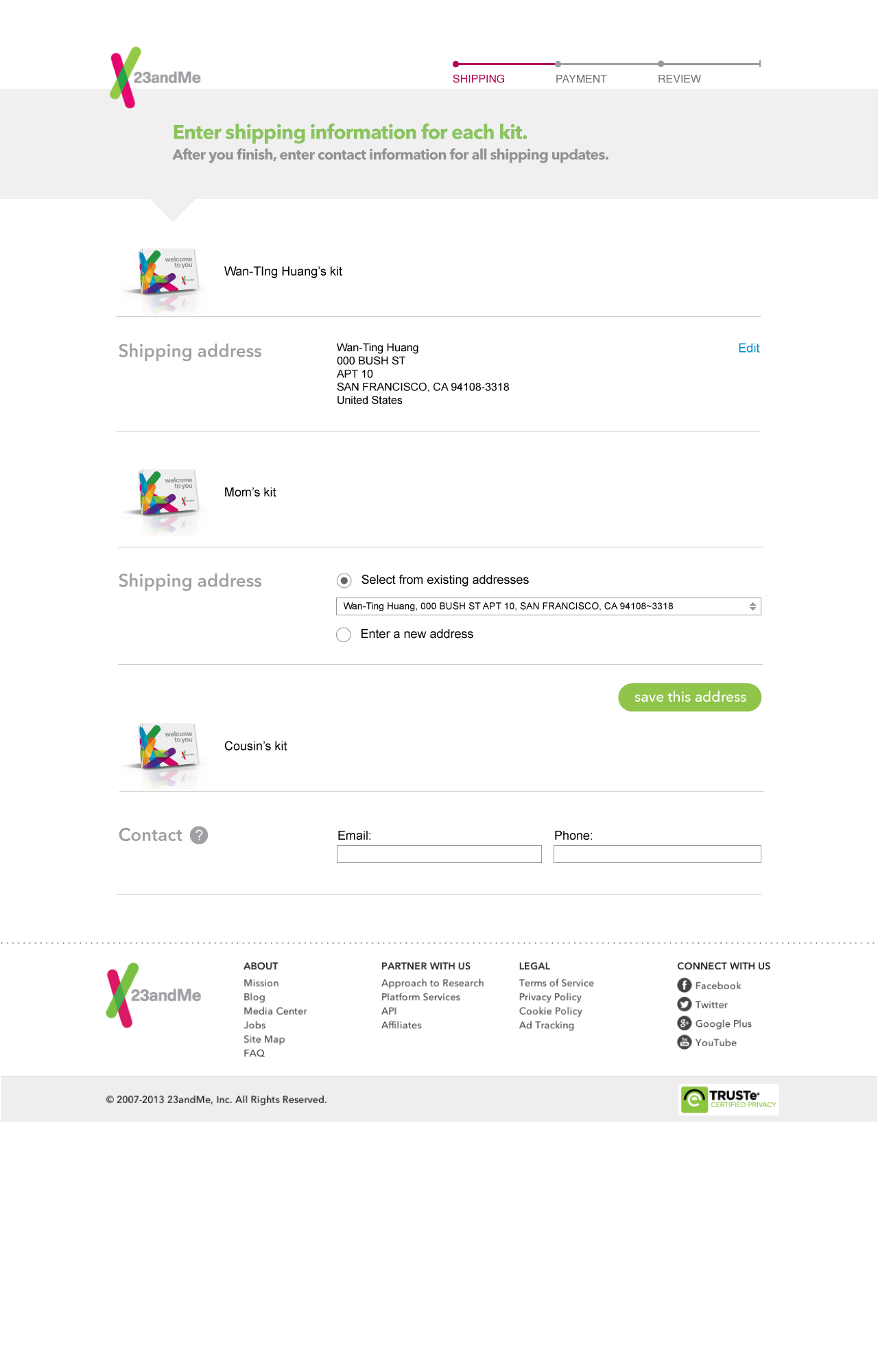
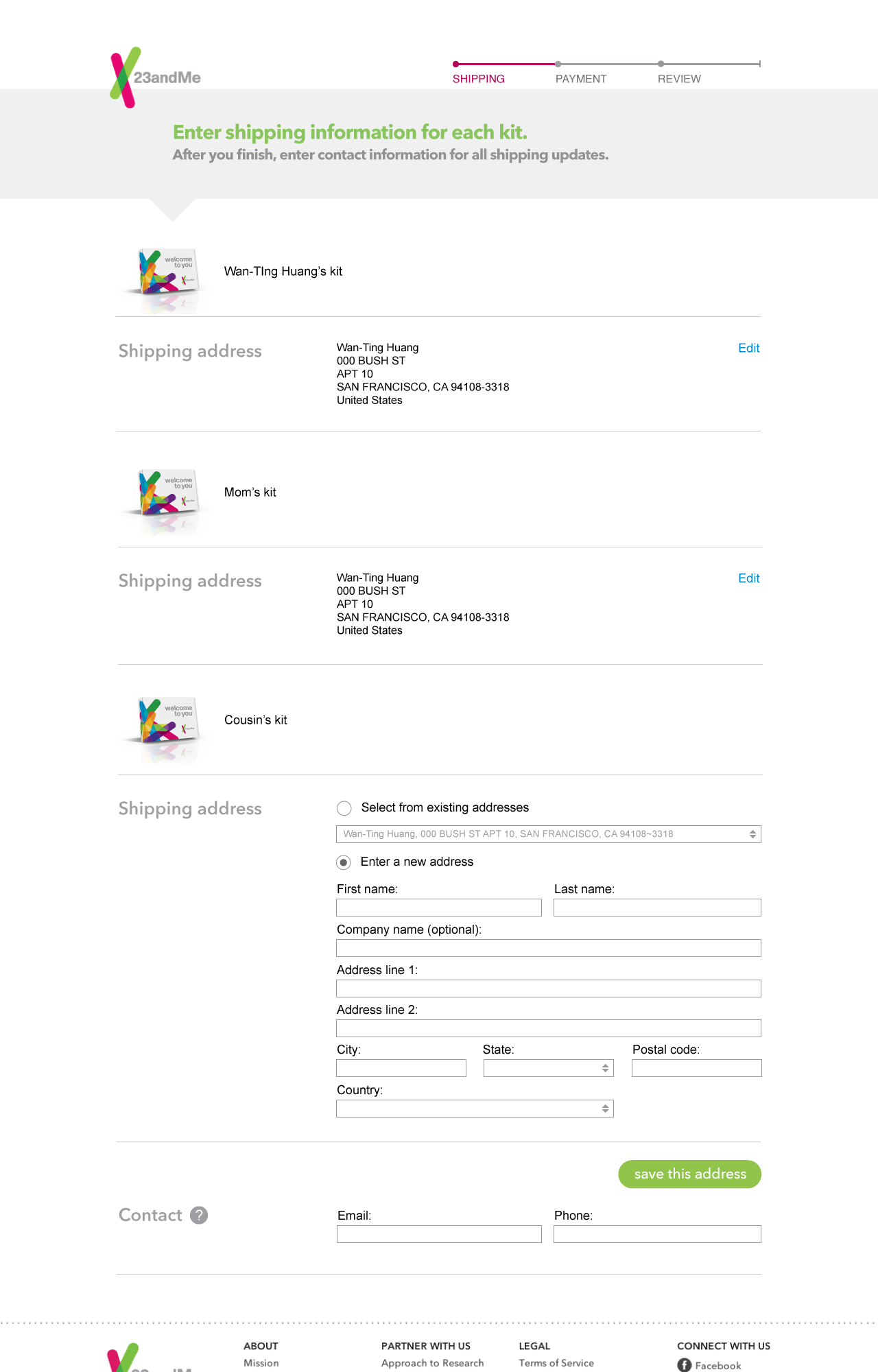
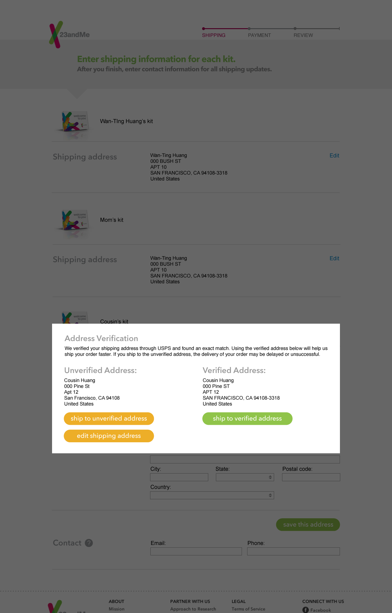
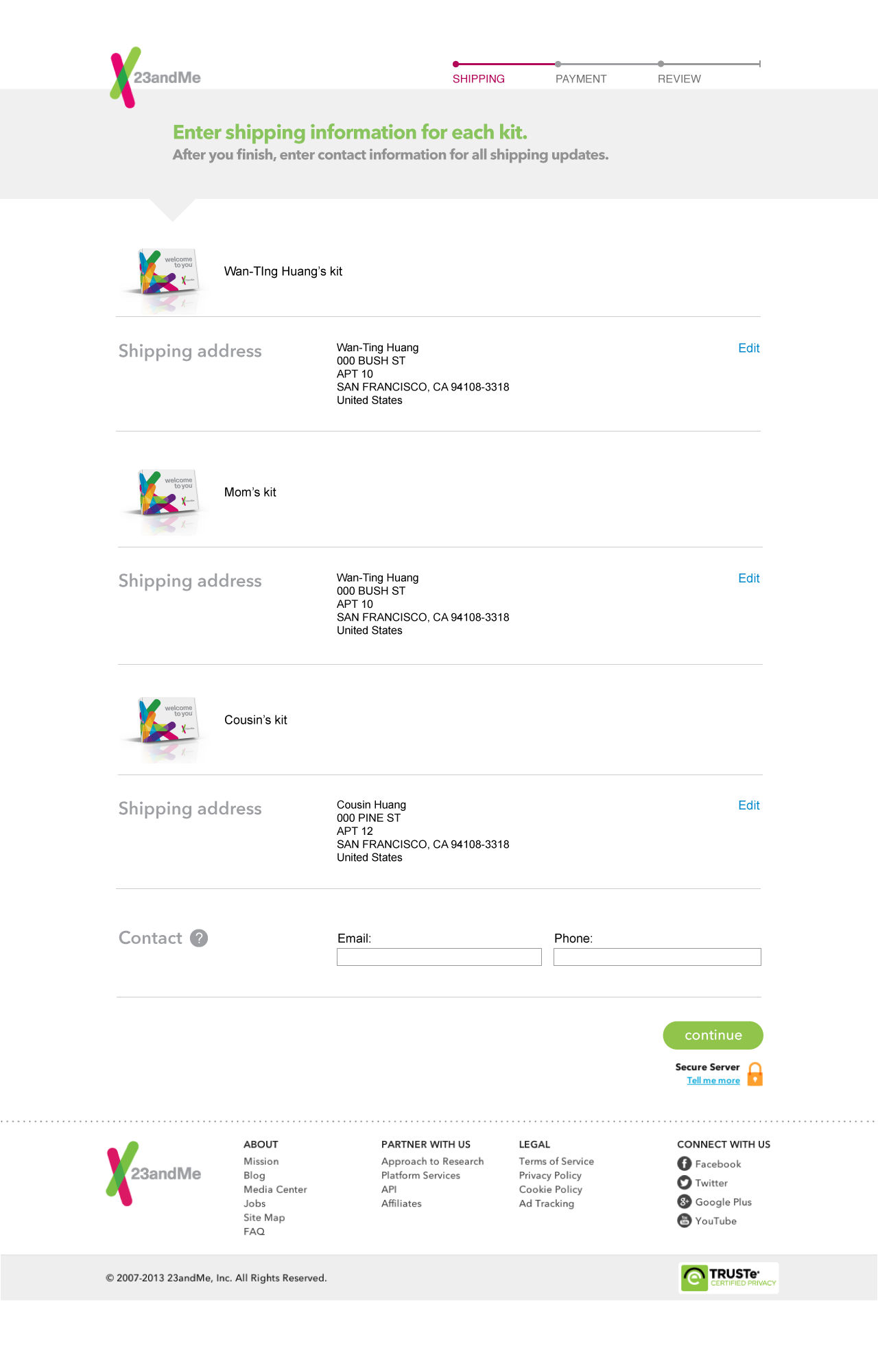
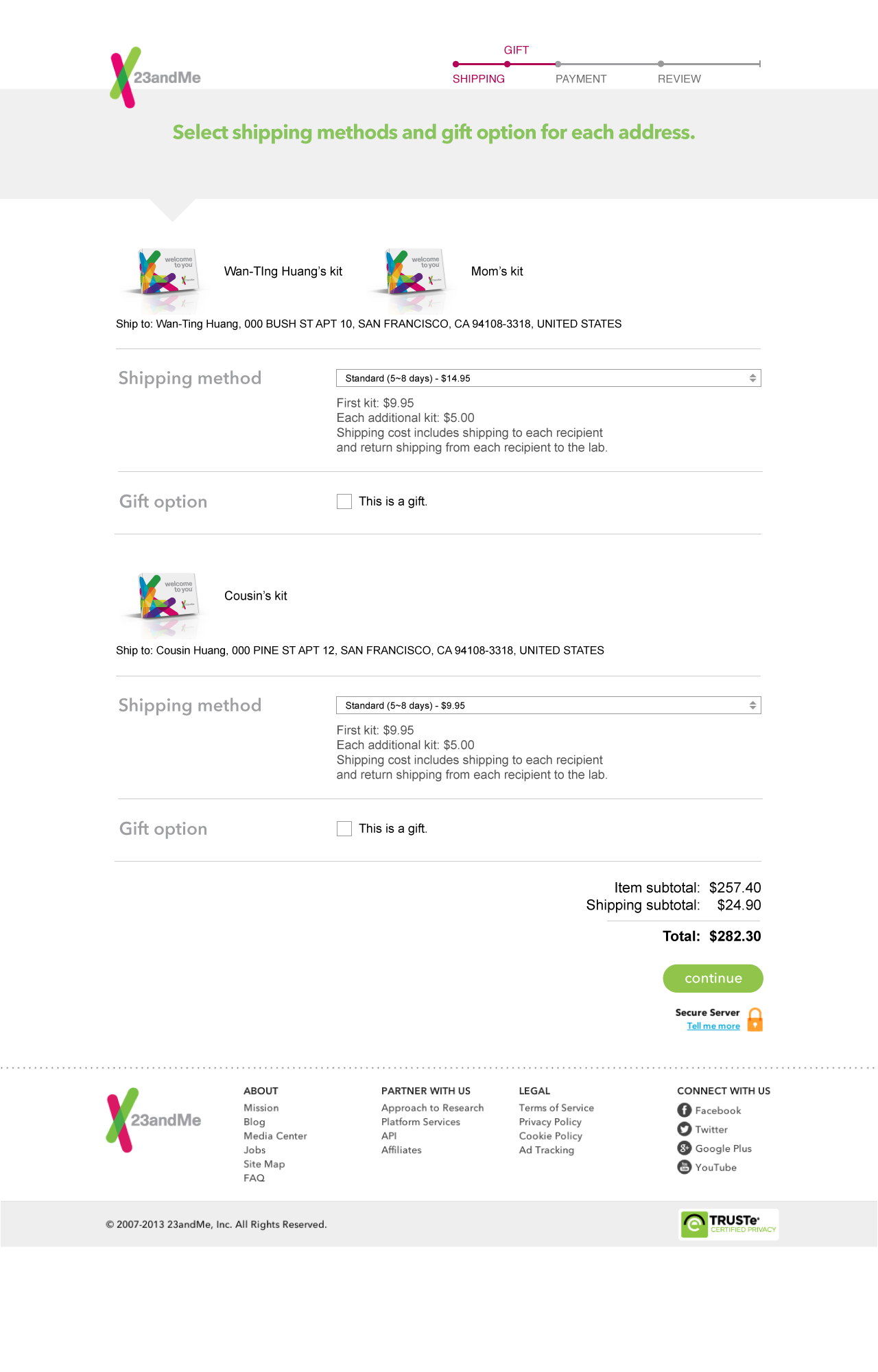
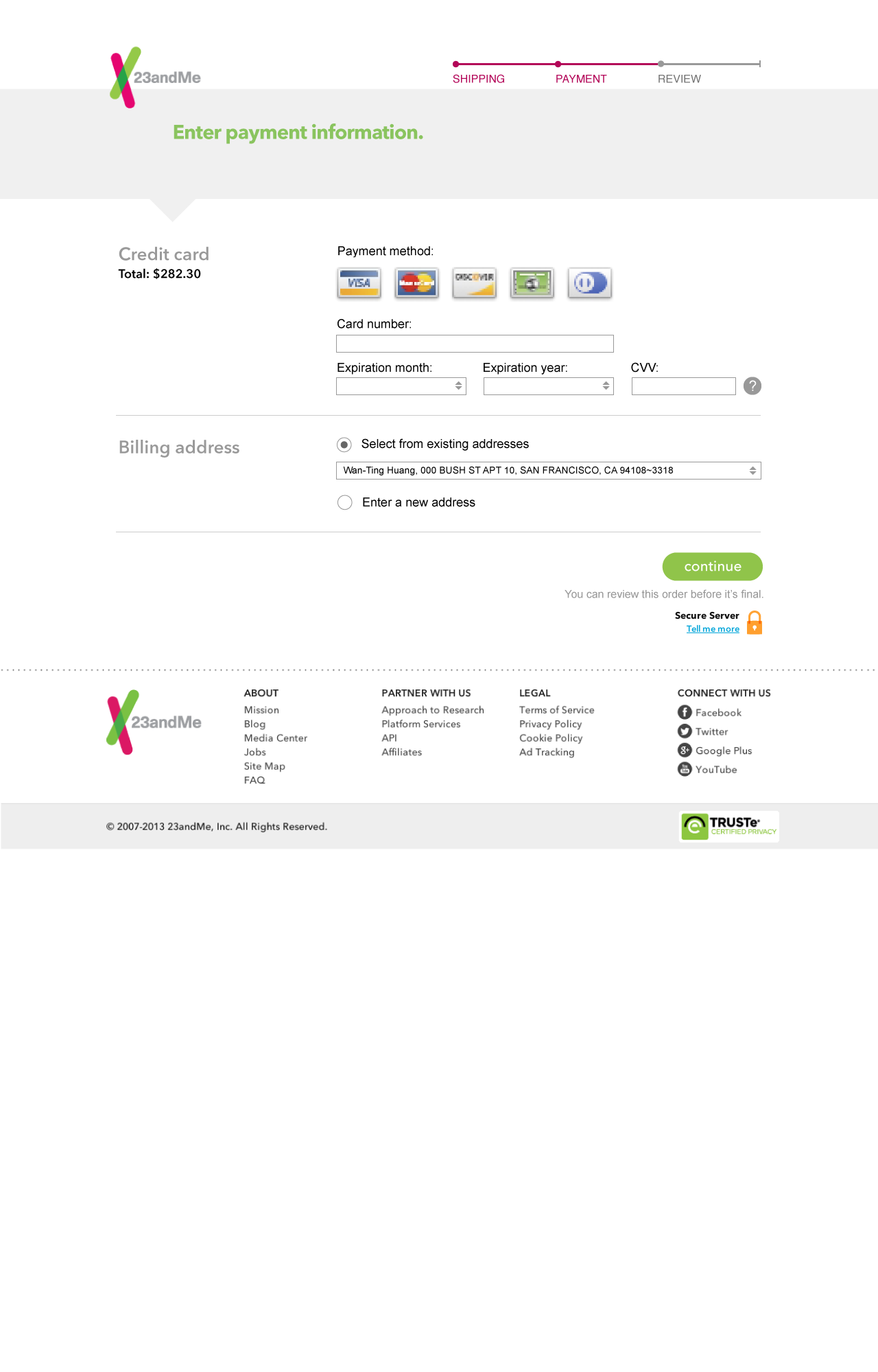
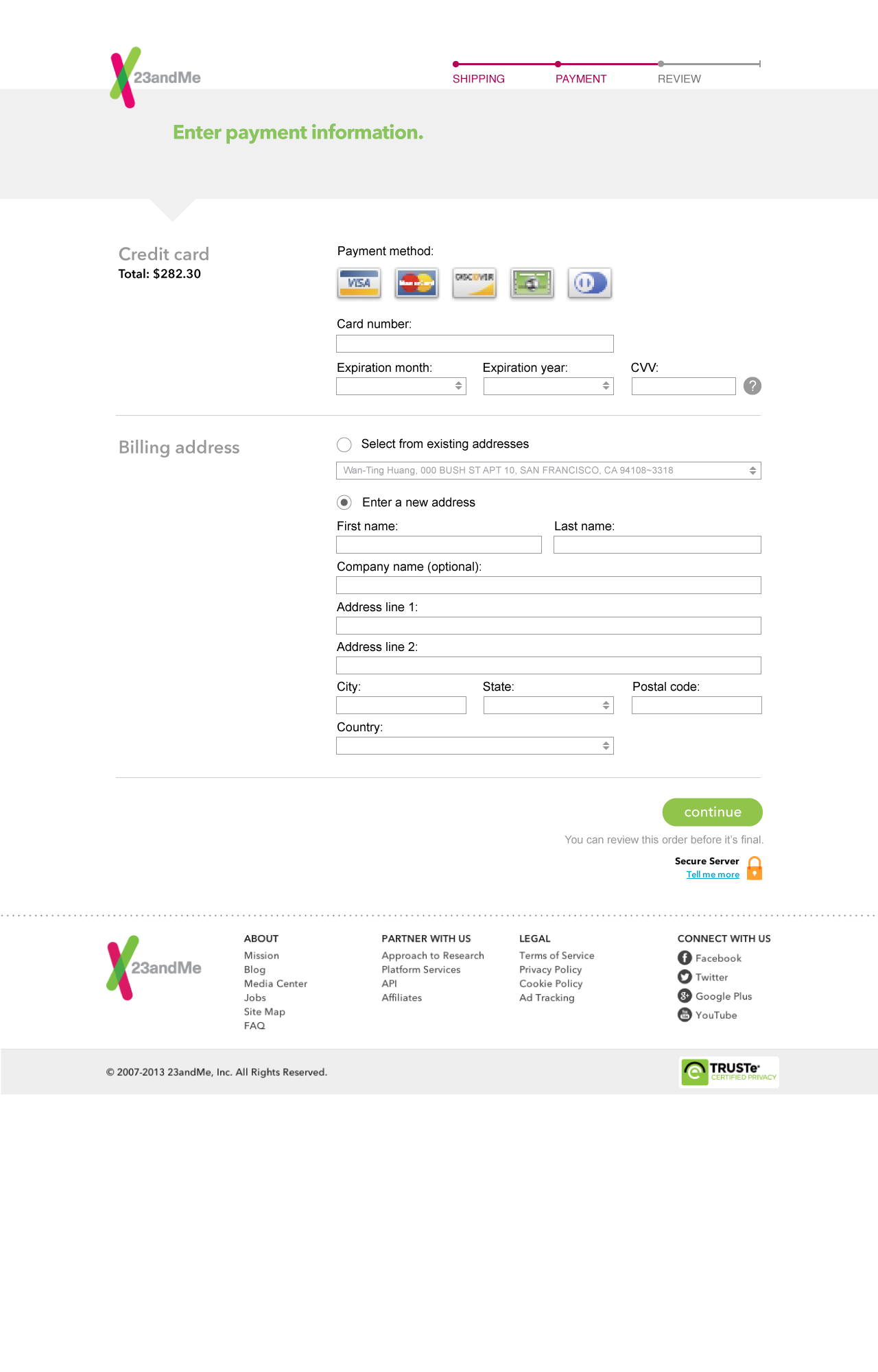
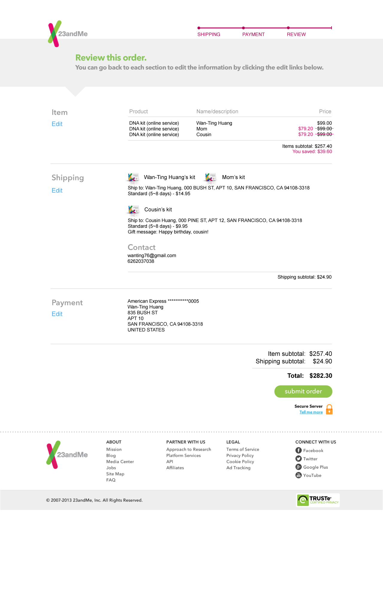
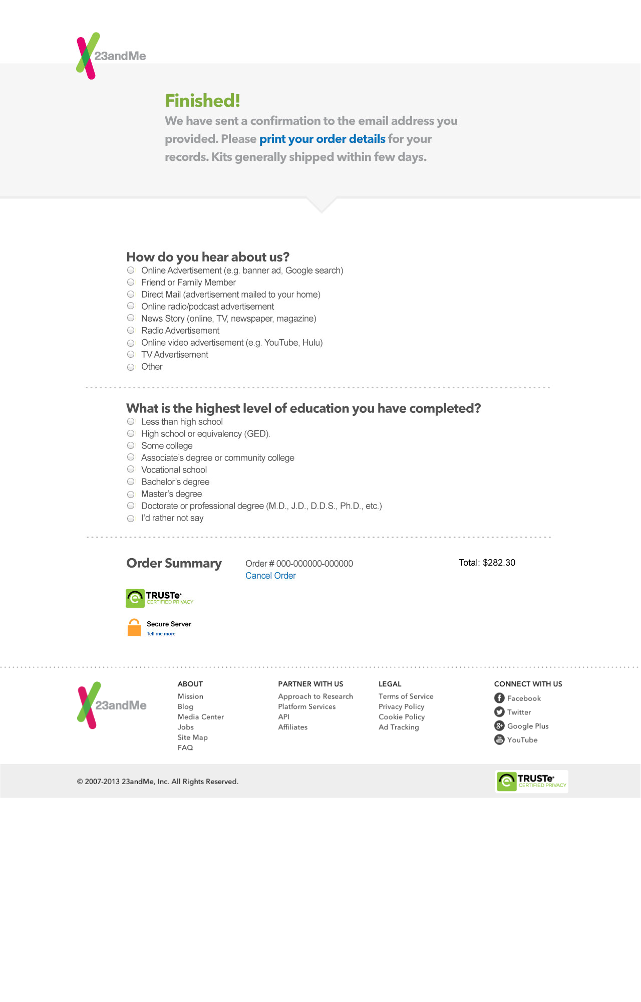
Screen flow for the multi-address checkout process
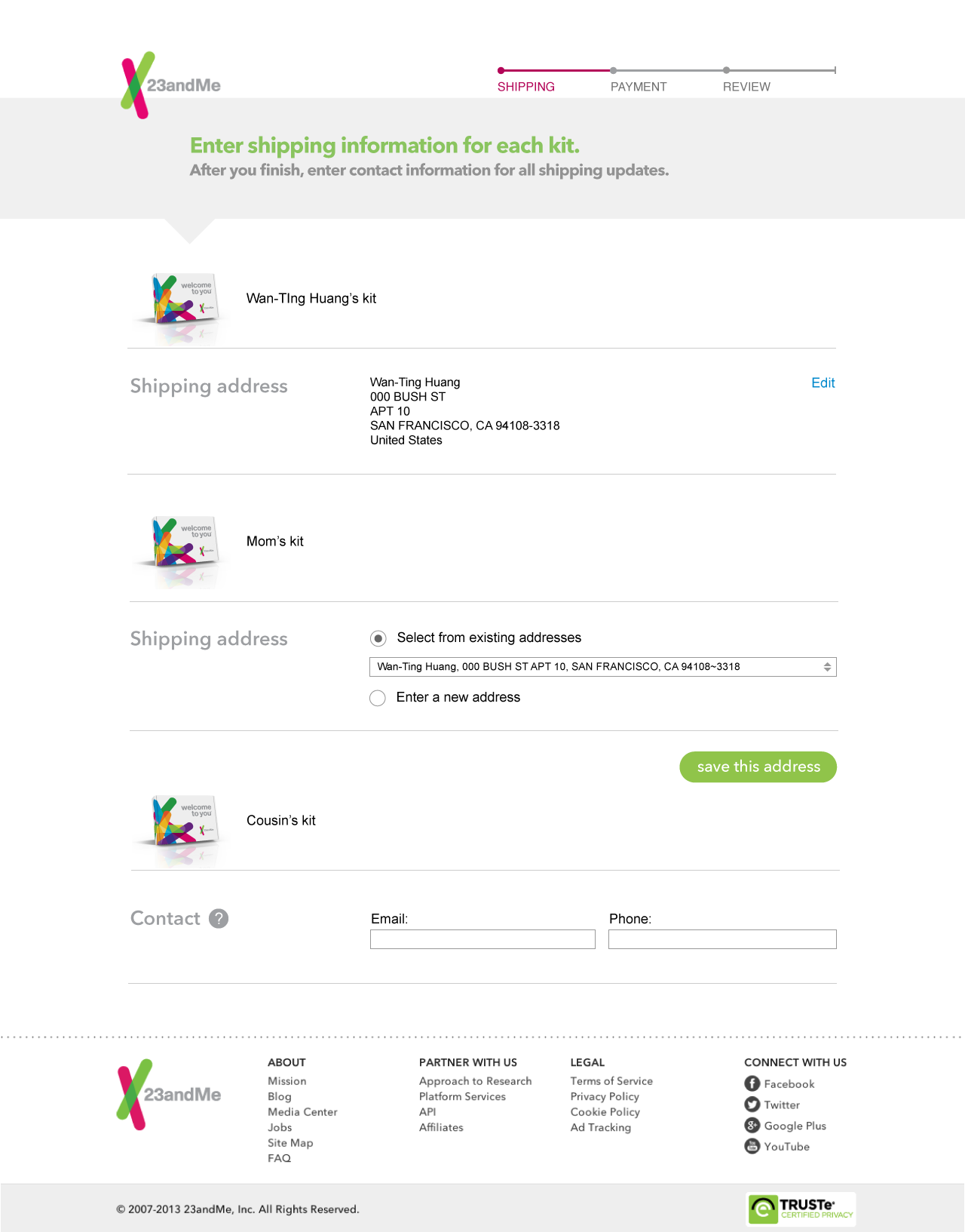
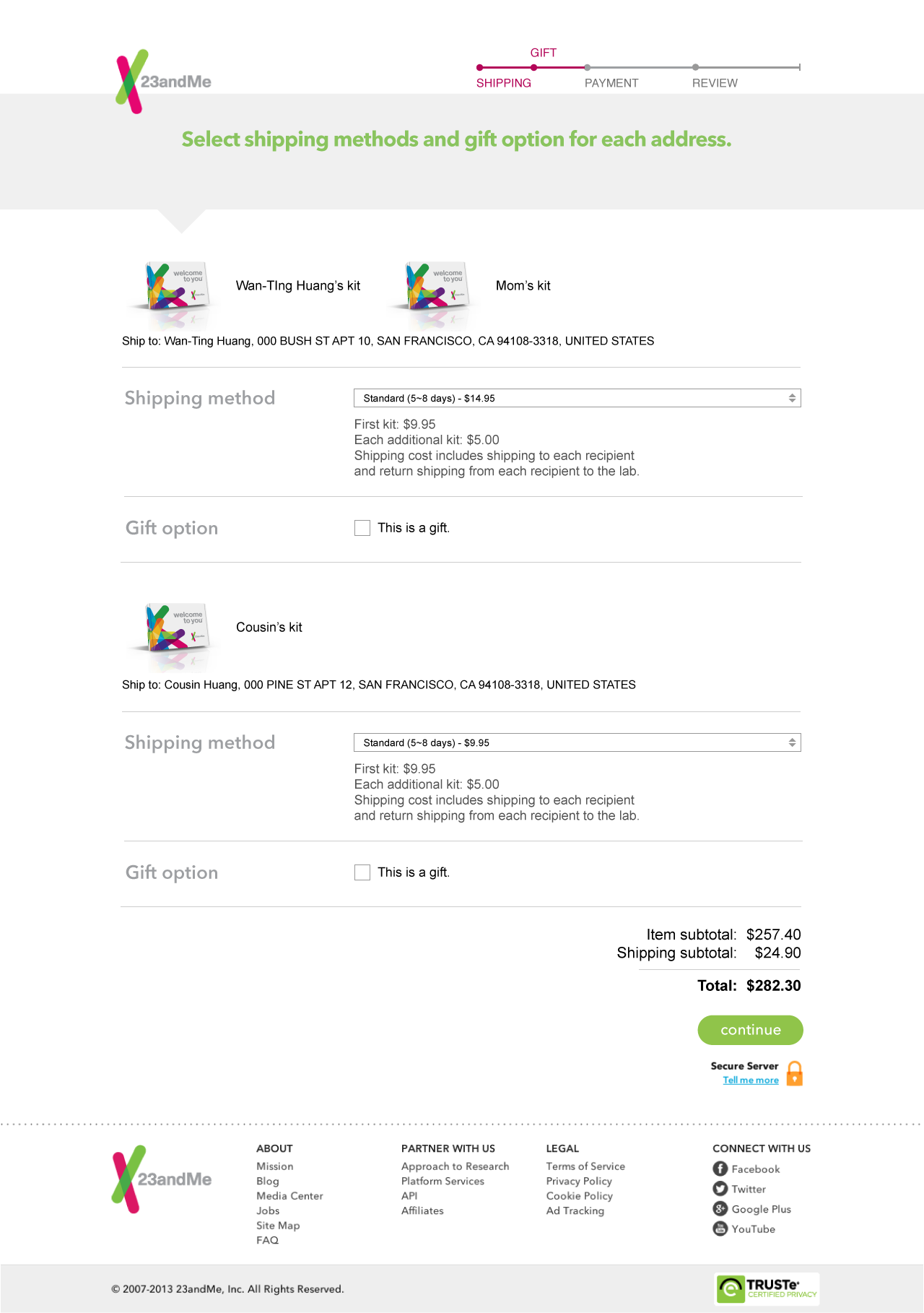
The screens for multi-address shipping and gift message
Responsive design
While redesigning the visuals, I also worked closely with developers to make sure that the designs for each screen breakpoint were properly implemented. In the end, I delivered mockups for various screen sizes as well as generating retina-display-ready assets.
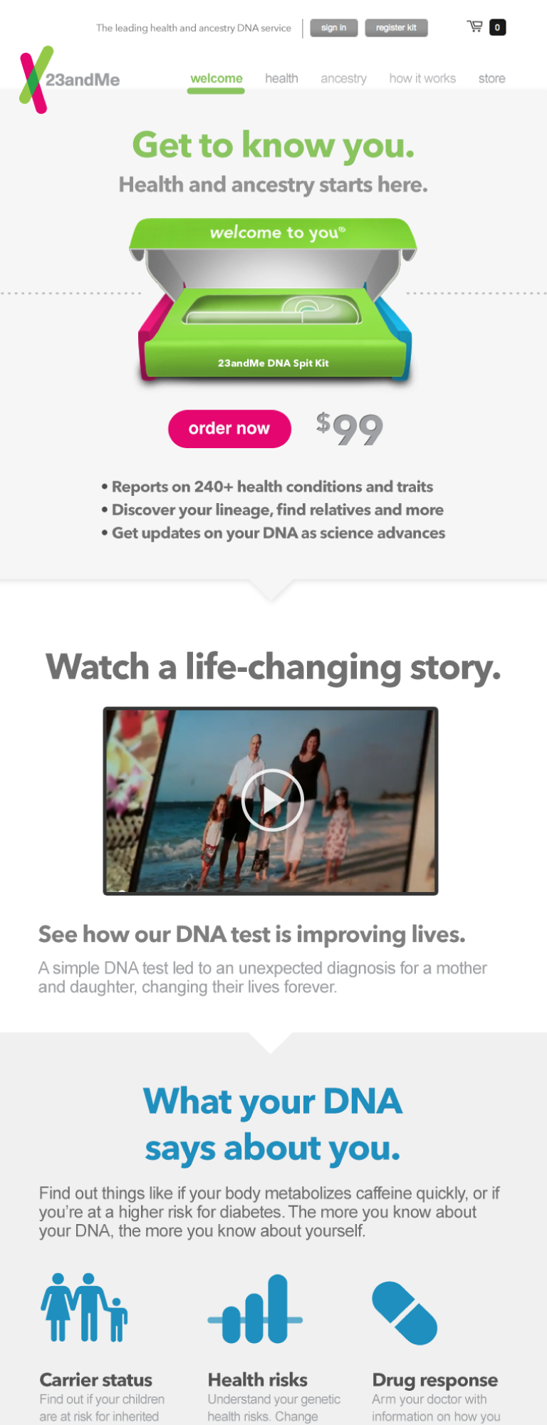

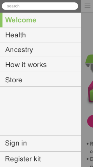
Homepage design for various screen sizes
Result and reflection
Unfortunately, this was one of those projects where good results ended up biting us in the back. After the new marketing site and the TV commercial were released, we saw improvements in conversion rate as 23andMe got more and more attention countrywide. However, this increased attention also aroused government concerns over the consequences of medical recommendations purely based on genetic testing. Thus, a big portion of the design on the marketing site as well as the actual product were discontinued until the concerns were later addressed.
As a designer working hard on the project, it was sad not seeing the full vision coming through, but at the same time, it humbled me to think hard about how much design and technology could impact a person’s major life decisions. It’s a designer’s job to design with good intentions, but there is no guarantee that the good intentions will end up being interpreted in the same way.